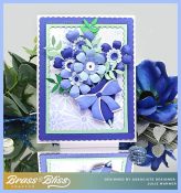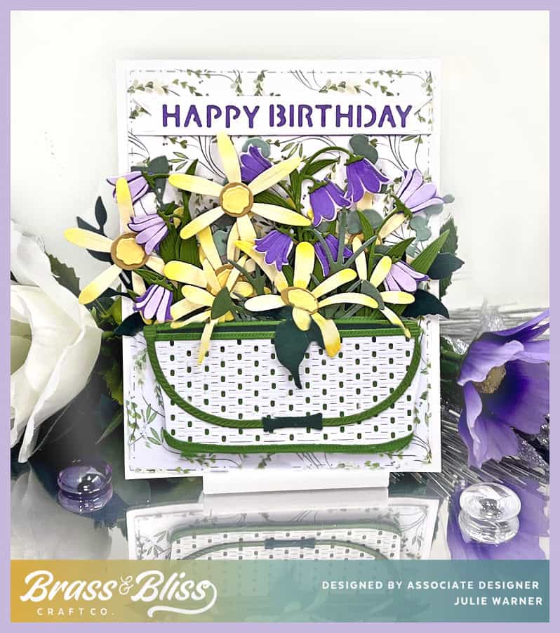

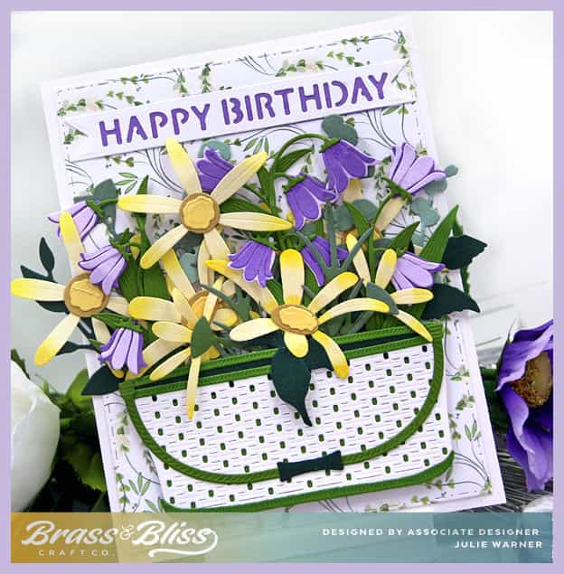
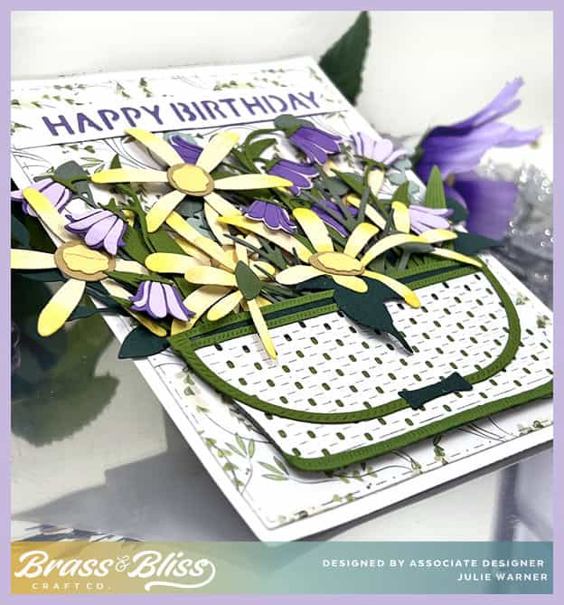
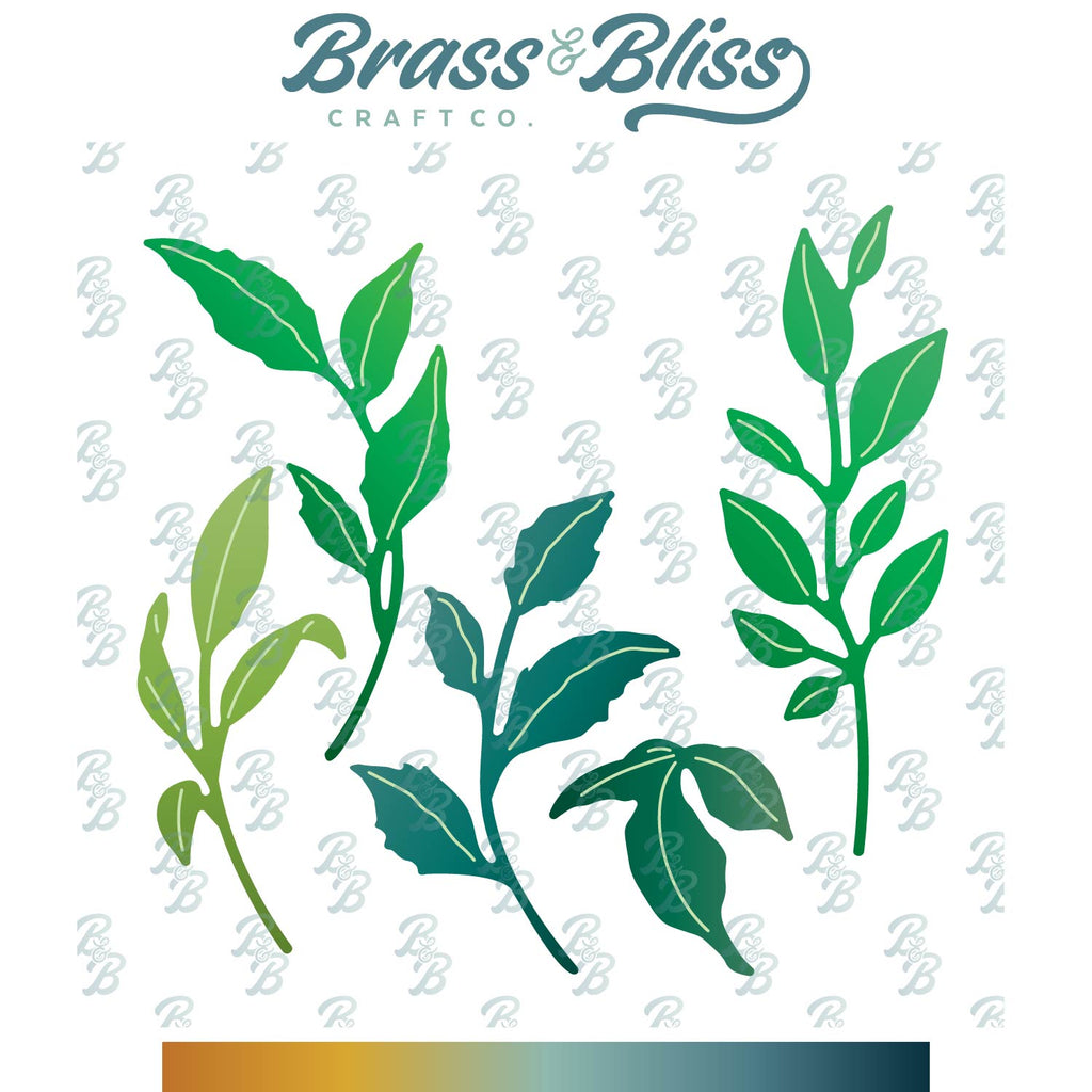
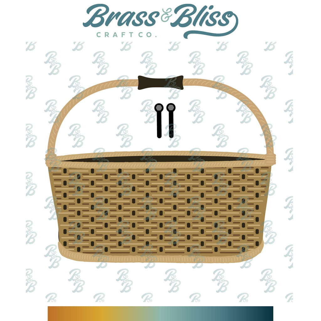
Today I have a birthday basket full of yellow and purple flowers. It is not hard, but it does take a little patience to get them all arranged as you like them. You’re going to love the detail on this basket! Change out the colors, change out the greeting and you have totally different card. I used several different dies set for the leaves but you can use how ever many you choose.
A big congrats to Kathy, the newest Featured Stamper FS1004! She has such a lovely gallery & I chose THIS to case. I kept the container full of flowers, but I used different dies, different colors & didn’t make mine a popup.
 |
|
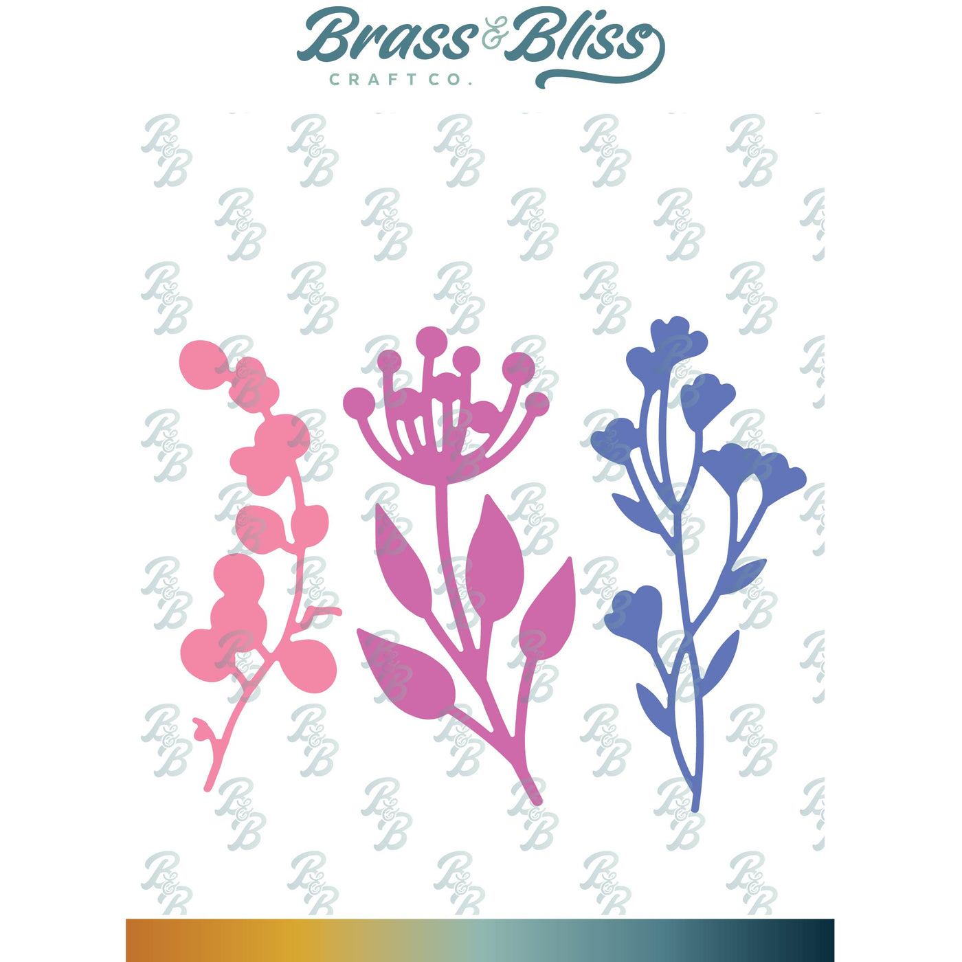
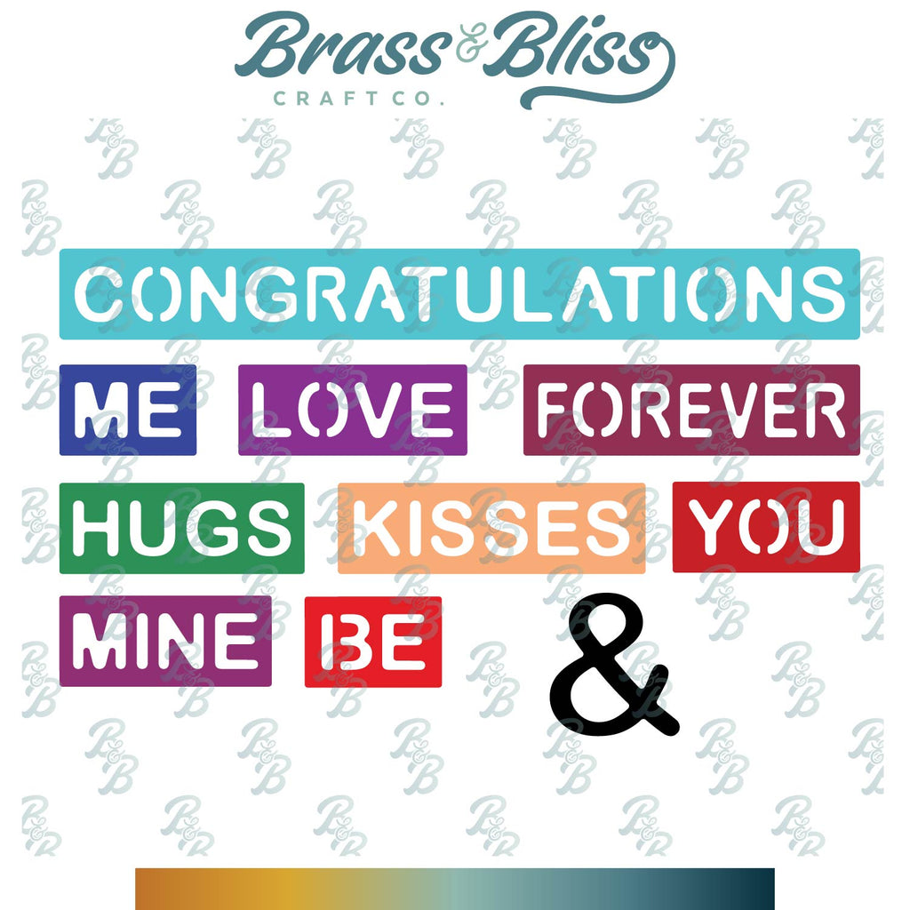
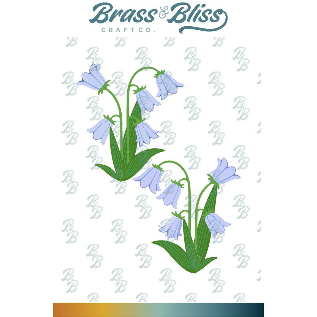
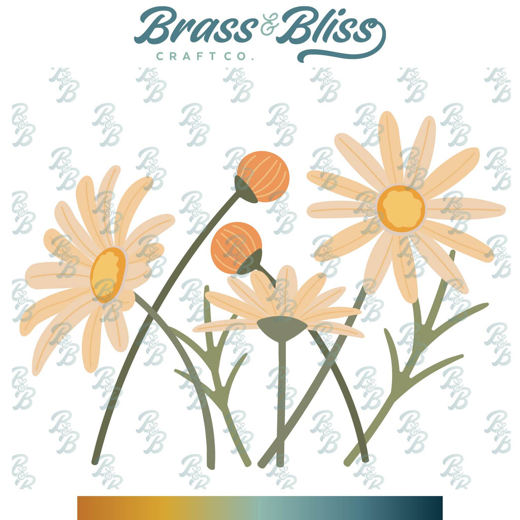
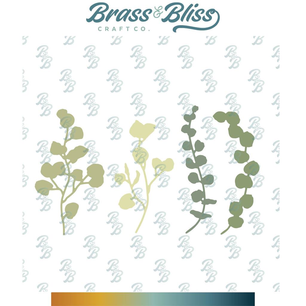
For my card, I die cut the yellow Chamomile flowers, added just a hint more of yellow on the outer edges, then glued them all together. I did the same for the bellflowers out of purple & lilac. All the eucalyptus branches, leaves & stems were cut out of several shades of green. The basket top was cut out of white & I used a mossy green for the underside, along with handle and trim. To make it a little easier while arranging them, I placed them on a glue gun mat (these are great because glue doesn’t stick to them) in a loose arrangement then put the basket on top to see if they fit. When I had them as I wanted, I put a piece of tape across the bottom & lightly dabbed glue behind some of the flower to hold them together, Then I popped up the basket 1 layer & attached it on top of the flower, letting a few petals hang over the top. I cut another layer of the basket back & attached it behind the flowers to make sure they stayed together. It was attached to a piece of floral paper. The greeting is from another die & it was cut into the longest flag banner & backed with a piece of purple.
Thanks so much for stopping by!

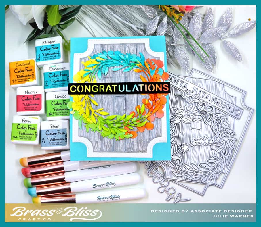
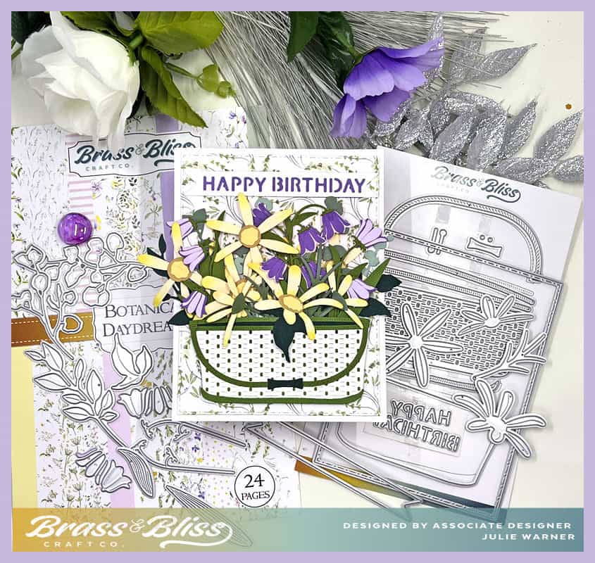
Supplies: (click the names below the pictures to take you to the products)
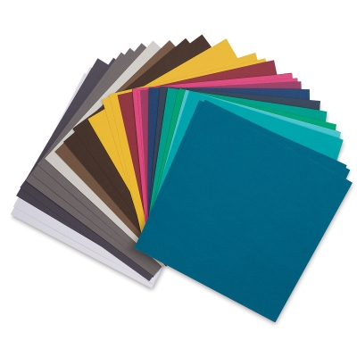
| Stamps: none |
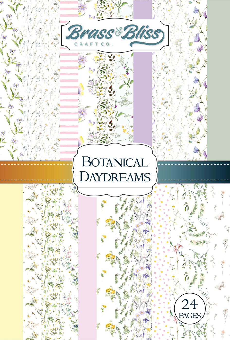
| Paper: Staples 110# white, grass green, mossy green, pine green, purple, lilac, pale yellow, mustard, yellow, Brass & Bliss: Botanical Daydreams paper pad |
| Ink: none |
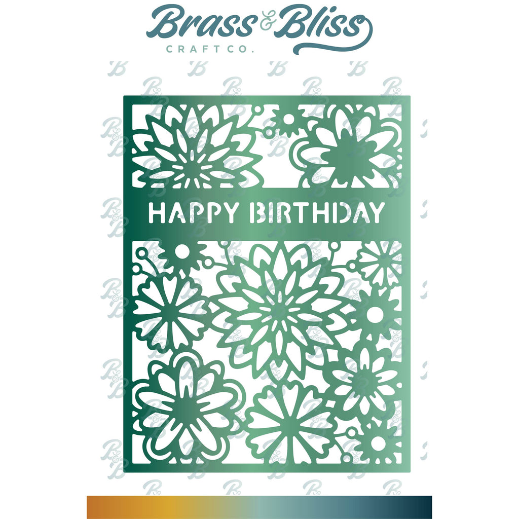
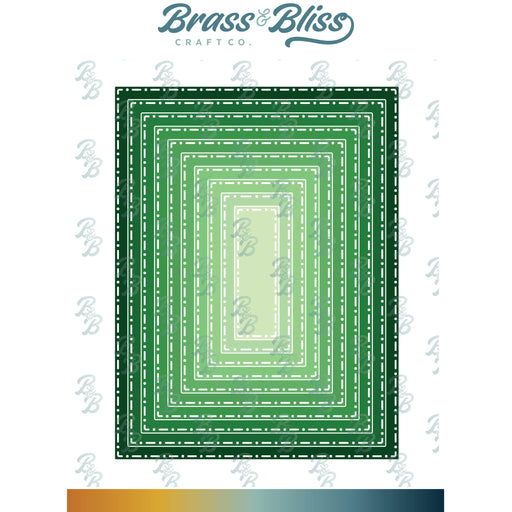
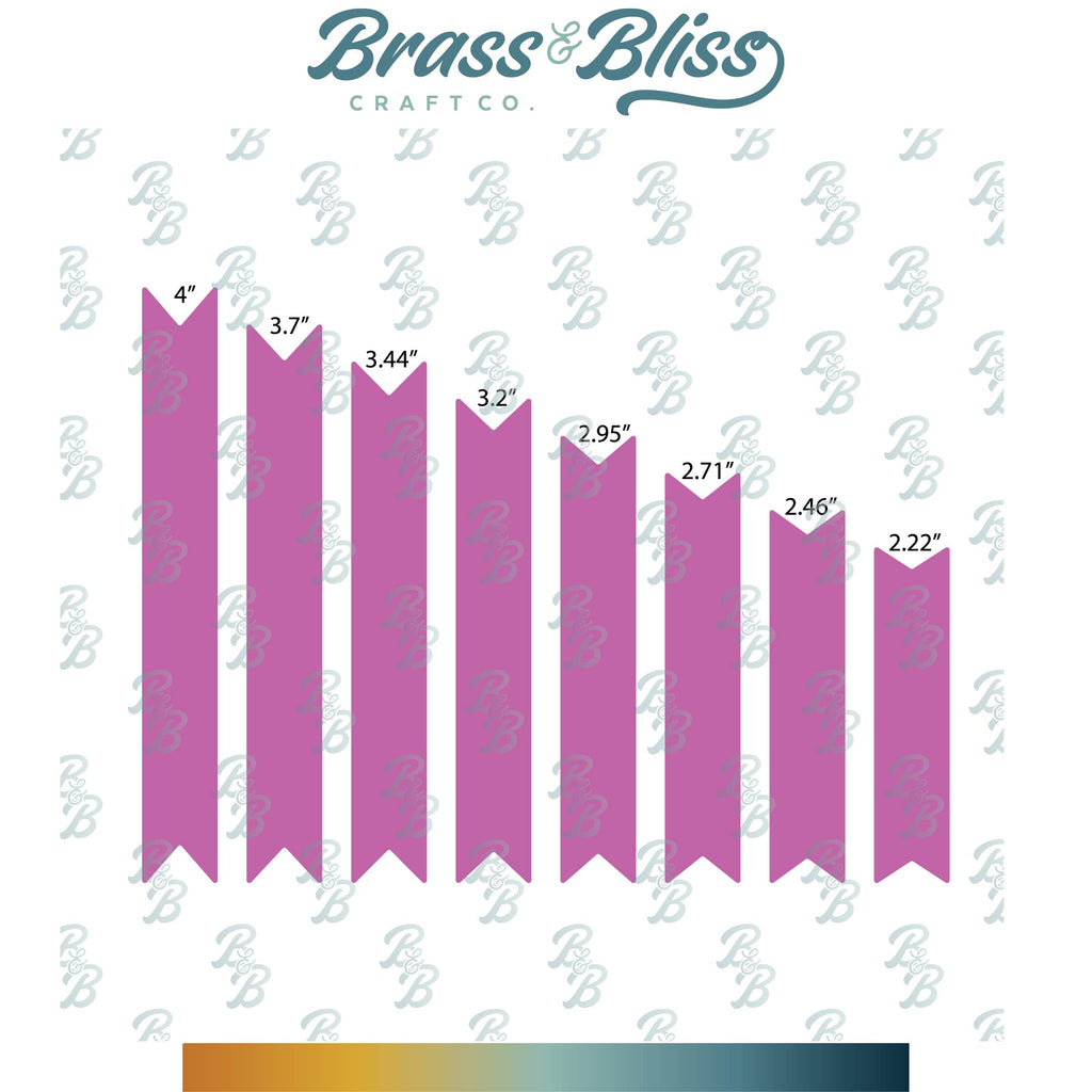
| Accessories: Brass & Bliss: Wicker Basket, Wild Leaves, Build a Bloom Chamomile, Build a Bloom Bell Flowers, Eucalyptus Branches, Flag Banners, Stitch Dot Rectangles, Floral Layer w/ Birthday dies |
|
|
|
|
|
|
|
|
|
|
|

|
You might also like: