• Tag Archives faux brads
  • Dare to Get Dirty Week Continues!!

    Judging from Fan Club response so far, Dare to Get Dirty 2010 is a hit! And it’s a lot of fun. Not only do the FC Members get a chance to play in the dirt with the past and present Dirty Girls, they get to ask us questions or chat with us in the DTGD Forum. We still have more challenges – all the way thru Friday!

    Today, I’m hosting a DTGD challenge and also made a sample for my friend Cindy Haffner’s DTGD challenge! So I have a twofer today. (You can click any image to make it larger.)

    Julie Warner - justwritedesigns https://thewritestuff.justwritedesigns.com/

    This first card is for my challenge DTGD10justwritedesigns02.
    All images are DRS Designs.

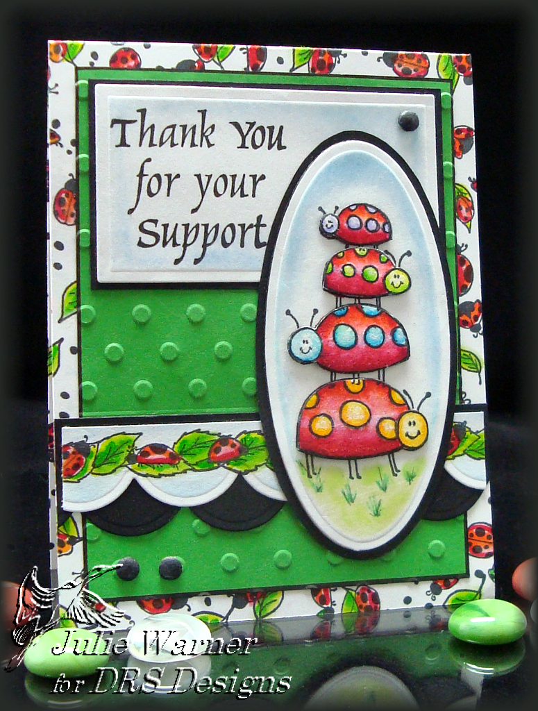
    I just love these ladybugs! I stamped the ladybug stack twice, die cut one with a Mega Oval, sponged the background and drew a few grass sprigs. The second one, I colored the ladybugs with marker, cut them out and popped them up just a smidge on top of the base image. I used the same oval die to draw a slightly larger frame on black c/s and hand cut it.

    The greeting was also die cut w/ a long rectangle (it was resized) and sponged w/ lt blue ink while the die was still in place. I used an embossing folder on the green panel. After stamping  and coloring the ladybug border, I cut the bottom with a Quickutz scallop border and sponged as before. I cut another scallop border out of black and offset it.  The front of the 4.25 x 5.5 (A2) card was stamped w/ the ladybug background and colored as before. I made 3 black Faux Brads and attached them.

    Supplies:
    stamps: DRS Designs
    paper: white, black, green
    ink: Ancient Page coal, Memories soft baby blue & soft green
    accessories: Tombow markers, Spellbinders mega oval & long rectangle dies, Quickutz scallop border, Cuttlebug Welcome Baby combo (used the emboss folder only)

    Julie Warner - justwritedesigns https://thewritestuff.justwritedesigns.com/

    This second card is for Cindy Haffner’s challenge DTGD10cindy_haffner.
    All images and embossing powders are Sparkle N Sprinkle.

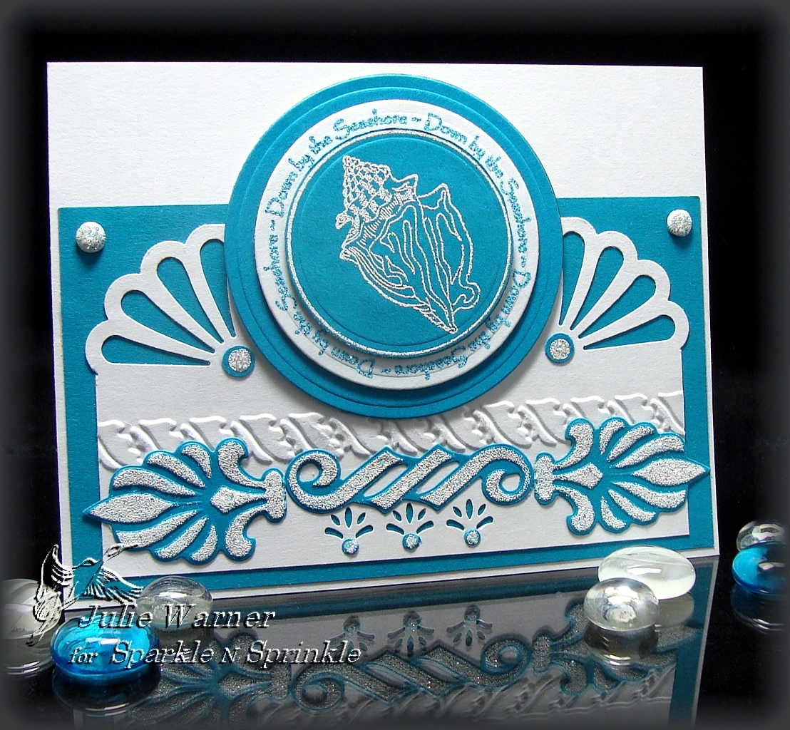
    For this one, I stamped and embossed the seashore circle first w/ white on the teal and again w/ teal on the white. I die cut the center only of the teal and the entire circle of the white one. The smaller teal is popped up slightly on top and I cut a bigger teal circle to back the two. The white panel has the upper corner punched with a deep edge punch and the center lower section punched w/ a small border punch. I used a Cuttlebug border to emboss the flourish across the center.

    The teal elements were die cut using the Spellbinders Symbology set. I left the die in place, sponged on white ink and embossed w/ the vanilla ice ep. I cut the ends off the two fan like elements and attached them under the embossed strip. An 1/8 inch hole punch was used on the parts I cut off and I glued the 3 tiny circles under the lower punched border. I used a small pencil eraser to dot the white ink on a teal scrap and embossed it then placed these circles under the upper punched corners. I made 2 vanilla ice embossed faux brads and attached them to the upper corners of the teal panel.

    Supplies:
    stamps: Sparkle N Sprinkle
    paper: white, teal
    ink: white & teal pigment inks
    accessories: Vanilla Ice & Poolside embossing powders, Spellbinders lg circles & Symbology dies, Cuttlebug organic flourish border, Martha Stewart daisy fan punch, small border punch, 1/8 & 1/4 inch hole punches

    Thanks so much for stopping by! I hope you’ll drop by Splitcoast and check out all the fabulous challenges. You’ll need to be a Fan Club Member to view them. So if you’re not a FC Member, why not join? It’s less than most magazine subscriptions and way more fun.
    SaveSave


  • ISC June Release Day 1- Butterflies!

    Are you ready? Do you love realistic nature images? Well, the next 4 days will surely jump start your creativity! The Creative Architects were challenged to create unique card folds with these new lines!

    Today we start with 2 card designs using Beautiful Butterflies II & III.

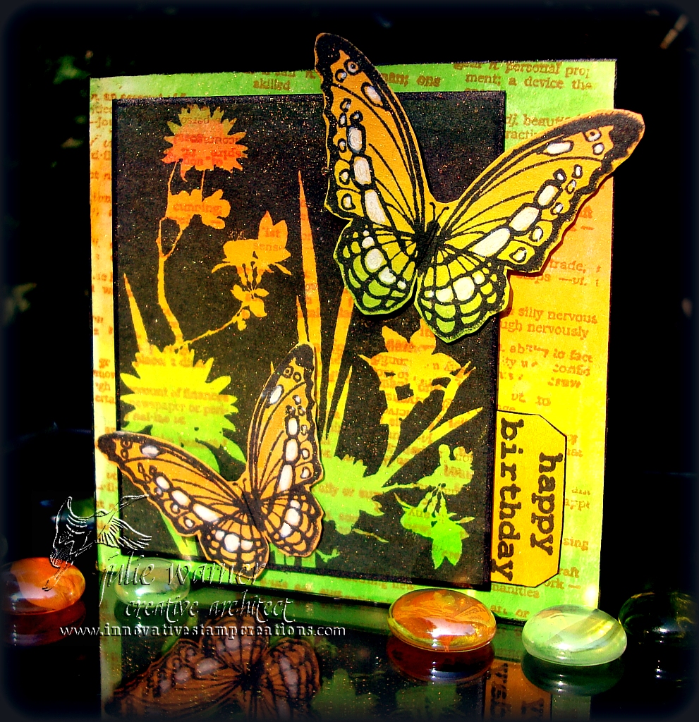
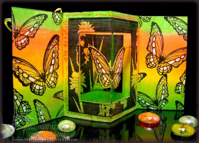
    For this first card, we used a 4×4 Pop Out Frame  (original is not available, but I found a Pin of it) template. It looks a little intimidating at first glance, but it’s not hard.  Just follow the directions by starting with an 8×8 piece of card stock. After the scoring, folding and cutting, your card will be doubled in weight so I wouldn’t recommend a heavy card stock. The finished size is 4×4 when it’s closed.

    (Click any image to enlarge)

    Julie Warner - justwritedesigns https://thewritestuff.justwritedesigns.com/

    This is the front, closed view. I started with white c/s, stamped the text with sunburst ink then brayered over it with a rainbow ink  pad. I stamped the reverse image flowers on top with black ink. The butterflies and sentiment were stamped on a separate piece of brayered c/s and cut out. I added some white gel pen accents on the butterflies.

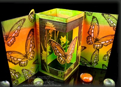
    The next two are the inside and inside top views in order to show how the inside operates. The inside was brayered like the front and on a separate brayered piece, I stamped the reverse flowers again and used a Spellbinders square to cut out the center. I used the frame it left around the opening and attached the cut out square to the backside of the card. The cut out butterfly is scored in the center and suspended by the green thread down the center and 2 small black threads on either side. I misted the outside and inside with a little gold Shimmer Spritz.

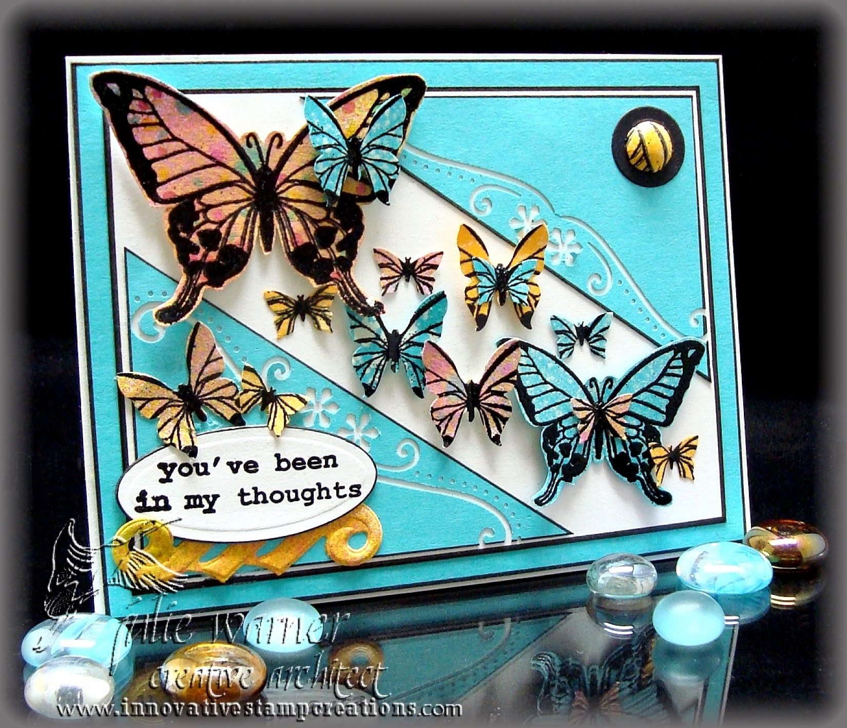
    Julie Warner - justwritedesigns https://thewritestuff.justwritedesigns.com/Julie Warner - justwritedesigns https://thewritestuff.justwritedesigns.com/For the second card, we used this Inspiration Picture. I liked the diagonal flow and all the multi color butterflies.

    Julie Warner - justwritedesigns https://thewritestuff.justwritedesigns.com/

    I worked this card a little backwards by starting with a 5.5 x 4.25 white card and cutting the turquoise and white layers to fit it. I did it this way in order to figure out what size to make my top, diagonal cut turquoise mat. After I cut it, I used a border punch along the inside edges and all layers were edged with a black marker before assembling.  I had some backgrounds I made previously (the pinkish one was done with dye reinkers mixed w/ water and spritzed onto c/s;  the turquoise was spritzed w/ bleach) and I stamped two sizes of the butterfly on them and black embossed them.  I cut two full butterflies out and used two sizes of butterfly punches on the rest. The sentiment was cut with an oval Nestie and I made a 1/2 inch faux brad and attached it to a 3/4 inch punched black circle and attached it in the upper right corner.

    Thanks so much for stopping by! Please stop by and visit all of the Architects and see the gorgeous work they have to share.

    Supplies:

    • stamps: Innovative Stamp Creations
    • paper: white, turquoise, yellow
    • ink: VersaFine onyx, black pigment, Kaleidacolor melon melody rainbow pad, Ancient Page sunburst
    • accessories: brayer, Scor-It, Martha Stewart  med. butterfly punch, sm butterfly punch (All Night Media), border punch (EK Success), black Permapaque marker, Spellbinders square, petite oval & symbology one dies, 1/2 & 3/4 inch hole punches (faux brad), black detail embossing powder, white gel pen, gold Shimmer Spritz (Tsukineko)


  • Mystique – FS168

    Mystique - https://thewritestuff.justwritedesigns.com/

    Weekly-Favorite

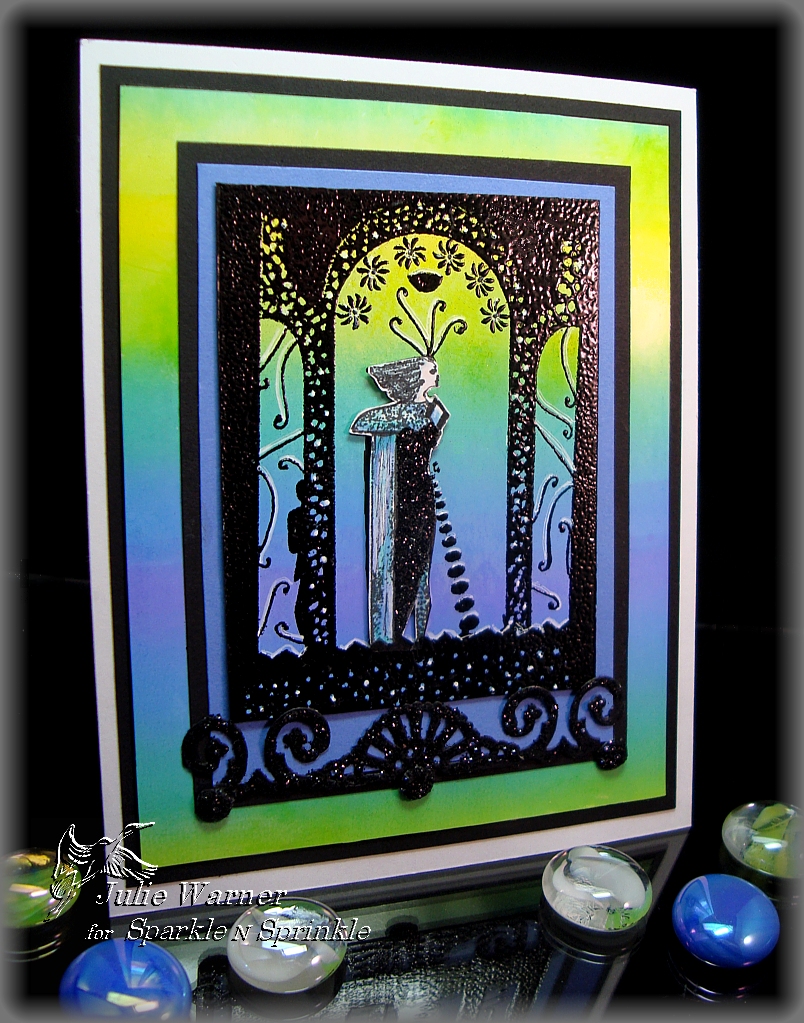
    Congrats to Gloria (GloriousGreetings) , the Featured Stamper today at Splitcoast.  I picked a couple that I want to case and this is the first one. I chose her Heartfelt Sympathy for this one. I kept the brayered background, silhouette images and big main panel, but I changed the colors, the images and added another layer.

    All images, embossing powder, adhesives and glitters are from Sparkle N Sprinkle. After doing a brayered bg on a 1/4 sheet of white glossy c/s, I used the static pad and stamped this great Art Deco image in the center of the panel  w/ black pigment ink and embossed it w/ black ep. Sometimes I’m asked why I don’t use clear ep w/ the black ink or black ep w/ a clear ink. Almost exclusively, I use an ink very close to the color of the ep I want to use because it gives me a much deeper color. It also hides any flaws like when a tiny portion doesn’t get the ep. I stamped the lady portion of the image again on a scrap of  matte white c/s using black permanent ink. On this image, I used markers to color her, cut her out and applied glue and black glitter to her dress. Then I attached her to the base image w/ a little card board under her to give her just a little lift.

    I used a craft knife to cut the base image along the straight sides because I used the rest of the bg for my big layer. Some highlights were added w/ a white gel pen and  lavender and black layers were added underneath before attaching it over the main bg. Another black layer was added then everything was attached to a 4.25 x 5.5 (A2) white card. I used a Cuttlebug ornamental border die to cut the black scroll element, brushed glue over it and coated it w/ black glitter before attaching it below the image. I made 3 faux brads and coated them w/ glitter as well.  If you’d like to see just how I make these nice rounded brads, I just finished a new Faux Brad Tutorial. I’d love for you to check it out!

    Thanks so much for stopping by! Your comments are always read and much appreciated!
    Julie2 sig


    Supplies:
    stamps: Sparkle N Sprinkle
    paper: white, white glossy, lavender(this is actually a clone of Ballet Blue, it just looks lavender next to these colors), black
    ink: Colorbox black pigment, Ancient Page coal, Tsukineko Kaleidacolor pad in Riveria
    accessories: brayer, static pad, embossing powder & glitter (both SNS), Cuttlebug ornamental border die, brushable glue and glue pen (both SNS), 1/4 inch hole punch and stylus

    SaveSave