• Tag Archives masculine
  • Nautical Vignette

    Julie Warner - justwritedesigns - https://thewritestuff.justwritedesigns.com

    I loved today’s Inspiration Challenge (IC324) site and I was so happy to make a sample for Stef! I chose This for my inspiration. Instead of the beautiful colors they used, I just went w/ a more distressed look but I really loved the triple vignette layout.

    All images are Our Daily Bread designs. I stamped the lighthouse twice and selected different areas of it and also the mighty sea scene. I used circle dies to cut them out and for the maroon frame, I used two sizes of circle dies to cut out the “porthole” frames.
    Julie Warner - justwritedesigns - https://thewritestuff.justwritedesigns.com
    I stamped portions of the hymn on the crackled looking dp and distressed the edges w/ a tool and also w/ the tea dye ink. The netting was added on the left and the finished card fits in a #10 business envelope.

    Thanks so much for stopping by!


    Supplies:

    Stamps: ODBD- The Mighty Sea, All is Well Hymn, Keep My Lamp Burning
    Paper: vanilla fiber, dp (very old paper pad from ProvoCraft)
    Ink: Ancient Page cobalt, Distress Ink tea dye
    Accessories: Spellbinders circles dies, Tombow markers, netting ribbon, distressing tool

  • 2 Birds, 1 Ball

    Julie Warner - justwritedesigns - https://thewritestuff.justwritedesigns.com

    Fun challenge on Splitcoast today! Make your own backgrounds (F4A85)!

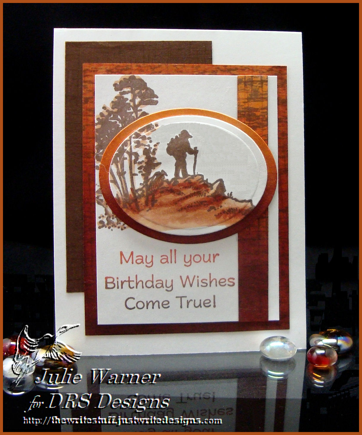
    The weekend is almost here and some of you are probably planning on a friendly golf game. The only golf I’ve ever played is miniature, but there are a lot of golfers in my family. So I think this would be the perfect masculine birthday card for one of them. All except my aunt Mary, that it is, lol. She LOVES to play golf. You could use it for other occasions, but I used the Above Par Birthday Greeting on the inside.

    This golfer reminds me a little of my husband. A long time ago, in a city far, far way,  we lived in a partially finished subdivision and he was out in front practicing his swing. He used to hit balls across the several unfinished streets and pay neighbor kids to shag the balls. So he’s out there one day and my daughter and I are on the couch in the living room. All of a sudden, there is a big CRASH, my glasses fly off my face and this golf ball lands about 3 inches in front of the tv. I wish I had a picture of the look on his face. When he shanked that ball, it hit the curb across the street and bounced back through the front window of our house. I guess if he had hit it any harder, he’d have hit two birds w/ one ball. Me and the tv, lol.

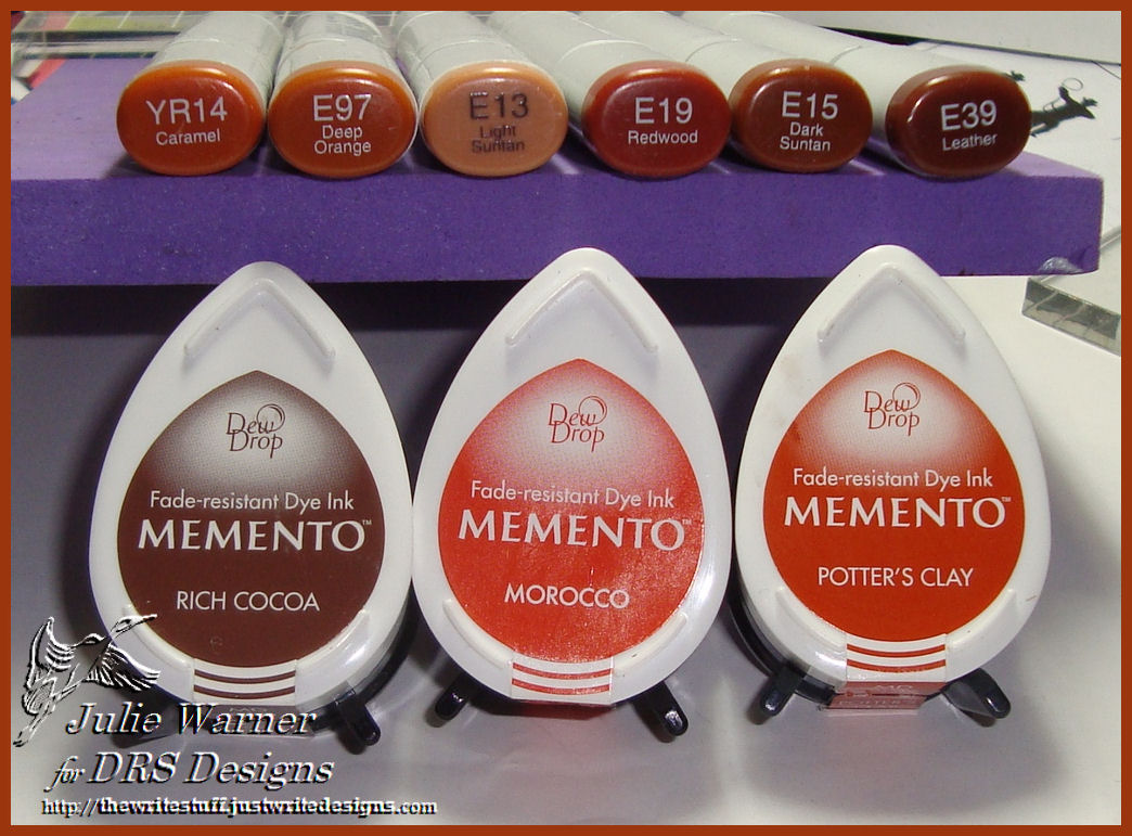
    All images are DRS Designs. For my self made backgrounds, I used a little stack of pigment inks that comes in coordinating colors to stamp the Golf word repeatedly. I also used it to make the narrow woven plaid strip. Golfer Duff was colored with markers and given a little out of the box treatment.The finished card is 4.25 x 5.5.

    Thanks so much for looking!


    Supplies:
    stamps: Golfer Duff, Golf, Woven Plaid
    paper: white, moss
    ink: VersaFine onyx, Colorbox Pumpkin Patch Queue pigment inks
    accessories: Tombow markers, brads

    I’m also entering this is the Dolce Stamps & Cards –DSAC02  Fall colors challenge


  • Sparkle N Sprinkle Blog Hop!

    Julie Warner - justwritedesigns - https://thewritestuff.justwritedesigns.comWelcome to our Not so Macho Masculine Blog Hop brought to you by the Sparkle Team of Sparkle N Sprinkle!

    If you arrived here from Barbara Bruder’s blog, you are in the right place! If not, you’ll probably want to go to the SNS Blog and start from the beginning.


    Julie Warner - justwritedesigns - https://thewritestuff.justwritedesigns.comWeekly-Favorite
    Best of 2011

    I’m going to share two different cards made using the same set, 1900 Cars set 285. For the travel card above, I used two different map papers, a new banner die set and labels 17  from Spellbinders. The antique autos on both cards were colored using a combination of  markers and Prismacolor pencils. For the Travel greeting, I used a bookplate die and bowed it slightly when I attached it.

    On the Classic card below, I cut out the roadster and also an extra left side (facing the viewer) and layered it on the base image for a little extra dimension. The background scene was stamped, masked, sponged and then colored w/ markers. The white frame used a lg oval Spellbinders die and a dot border embossing folder which I used a stylus to hand emboss around the frame.  Both cards measure 5.5 x 4.25. The Travel and Classic cards w/ full instructions are also on the SNS website.

    Julie Warner - justwritedesigns - https://thewritestuff.justwritedesigns.com

    Your next stop will be Jill Jacobson’s Blog, so hop on over! By the way, the product you can win from my blog is a jar of Berry Pudding Glitter Tinsel. If you haven’t tried it, please check it out. It’s fabulous! And this color is just scrumptious! Thanks so much for stopping by!


    Supplies:

    Stamps: Sparkle N Sprinkle – 1900 Cars, Scenery set 349 (for Classic card)
    Paper: Neenah white, dk red,  2 different designer/map papers
    Ink:VersaFine Onyx, Kaleidacolor Melon Melody, Desert Heat & Riviera  rainbow pads
    Accessories:White gel pen, Prismacolor pencils, Tombow Markers, 1/2″ Double Sided “Tear-ific” Tape SAT04, 1/8” Tear-ific Tape SAT02, Spellbinders Labels 17, petite ovals & Banner Basics 2 dies, Sizzix bookplate die, Cuttlebug dot border embossing folder, stylus, sponges, Stamp-a-ma-jig (SAMJ)

    More challenges for this:
    Stamps R Us – masculine
    SCS WT322 -trees, SCS FS223
    Kaboodle Doodles – lots of layers
    Cards for Men – someone special
    Tuesday Throwdown – die cuts
    Timeless Tuesday Challenge – anything goes!