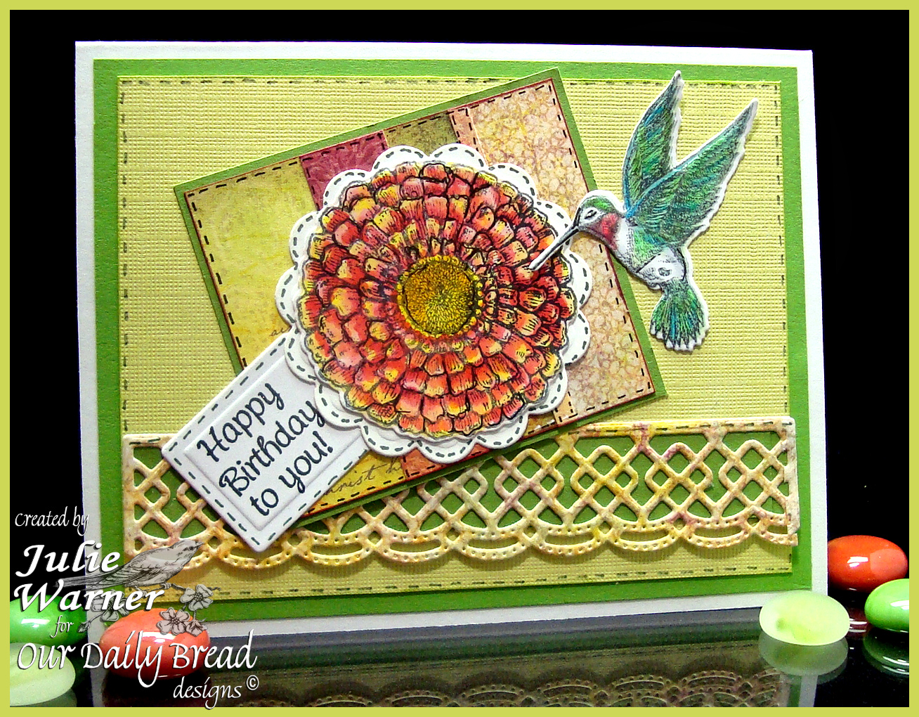

This is for today’s Sketch Challenge (SC479) on Splitcoast. It’s been a little while since I’ve done a sketch, so I’m glad I made it 🙂 With that being said, for some reason I have a real problem with most tilted sketches. I think they look great on someone else’s card but rarely on mine. So I’ll confess right now…after I took this pic, I pried the panel up and straightened it.
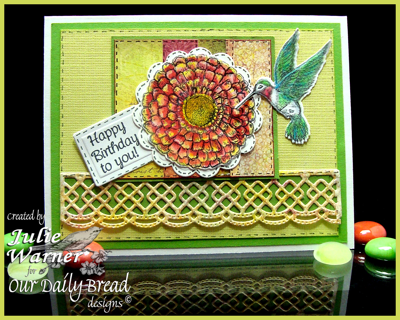
After stamping, coloring and die cutting the zinnia, hummingbird, border, tag & white backing behind the zinnia, I put it all together. The panel behind the zinnia is made up of leftover strips of the dp I put together. And here is the straightened version which I’m much more comfortable with, lol.
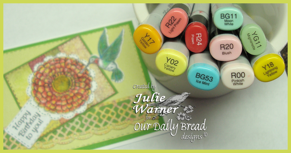
These are the Copics I used.
Thanks so much for stopping by!

Supplies:
| Stamps: Our Daily Bread designs – Zinnia, Hummingbird, Mini Tags 3 |
| Paper: white, ODBD Blooming Garden collection paper, lime green textured (DCWV), grass green |
| Ink: Memento tuxedo black |
| Accessories: ODBD Zinnia dies, ODBD Hummingbird die, ODBD Recipe & Tag dies, ODBD Beautiful Borders dies, Copic markers, black micron pen |
I like them both! Maybe you’d be more comfy with the tilted look if you straightened the sentiment? Just a thought. Either way the card is beautiful!
What amazing colours and colouring of the zinnia. Love the tilted. I don’t tilt enough as, like you, I’m uncomfortable with it.
I like them both but agree with Gail about the sentiment! I most often tilt on my cards…I think that it adds something…not sure what but something.lol
So pretty – tilted or not! I hadn’t really ever thought about it – so funny that you changed it and showed both versions! LOL Regardless of angle – the coloring is amazing!