• Tag Archives Serendipity Stamps
  • Serendipity SSCB #30 -Shades of Grey pt 2

    Julie Warner – https://thewritestuff.justwritedesigns.com

    Weekly-Favorite

    SS Button_design team_res
    Welcome to part 2 of the April Challenge for Serendipity Stamps! This month the challenge is Shades of Grey. The sale at Serendipity Stamps this week is buy 3 items, Get a 4th one free.  Good through 4/23.  And as always, we have a  have a gift certificate up for grabs to a random player.

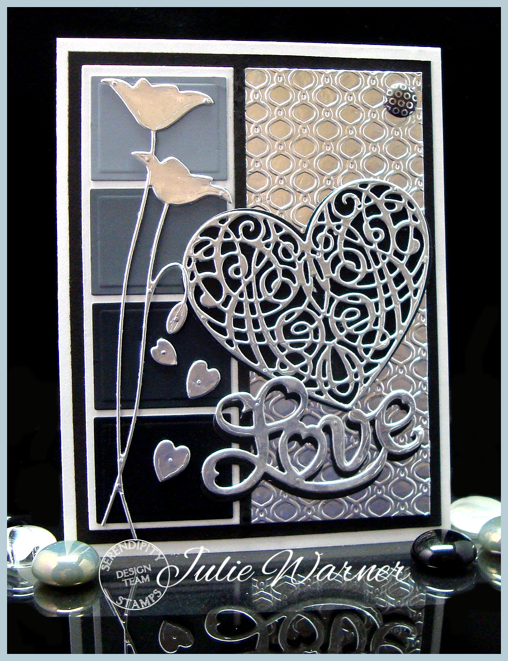
    For the design team, we have the added challenge of using a Love/Anniversary/Wedding theme. I had to really think on this as the black/white/shades of grey didn’t seem to fit really well with a Love theme. But this idea came to me to use a shades of grey paint chip for the side panels and aluminum foil covered card stock for the die cuts and embossed background.
    Julie Warner – https://thewritestuff.justwritedesigns.com
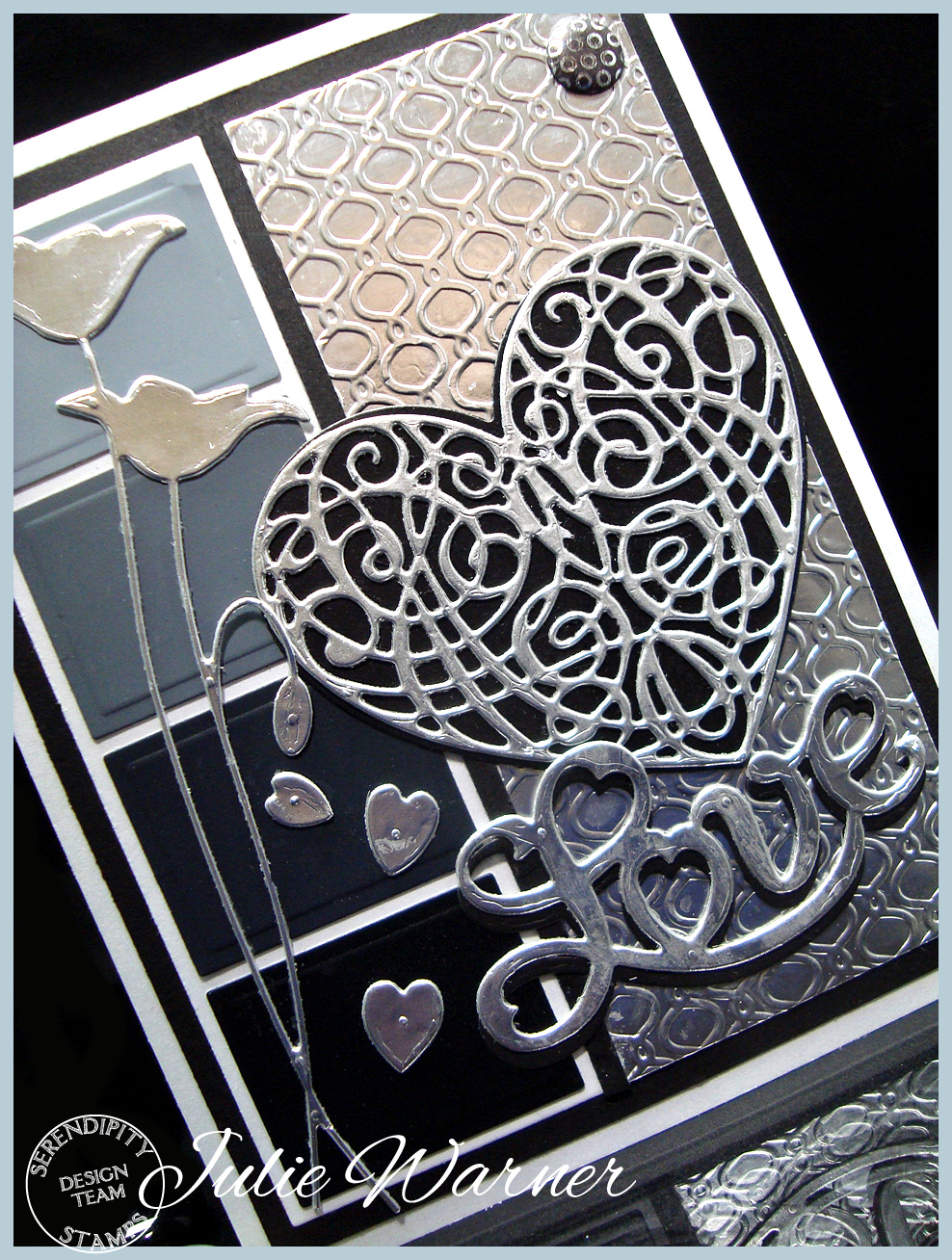
    Despite how it looks, all of the background is the shiny silver color of aluminum foil. I had a terrible time trying to photograph it. It reflected everything in front of it! I had to hold a white blanket over myself to keep it from reflecting my blue sweater and in the end it still picked up some of the color from the maple cabinetry behind me, so that’s the slight goldish color you see on the top section. I started by using a glue stick to apply heavy duty aluminum foil to piece of card stock. I die cut some of using the Heart Scroll and Love dies..a long narrow piece using the poppy die, and the rest I embossed with a folder for the background on the right. I used a rectangle die to cut the small rectangles on the left out of each of the shades of grey/black from a large paint chip. They were attached to a strip of white then to the larger black background. The 3 small hearts were all negative pieces from the Love die. I actually cut two of the Love dies…one out of the foil covered card stock and one out of black and I attached them on top of each other, slightly offset.

    Thanks so much for stopping by!

    Supplies:Julie2 sig

    Stamps: None
    Paper: white, black, large paint chip, heavy duty aluminum foil
    Ink:  None
    Accessories:  Serendipity Heart Scroll, Solid Heart & Love dies, Spellbinders rectangle dies, Memory Box poppy die,  Candi dot, Lifestyle/Quickutz embossing folder (Lattice set)

    Please be sure to stop by all of the DT blogs!

    Karen Amidon
    Marybeth Lopez
    Miriam Napier
    Pauline Pollington
    Vickie Zimmer
    Anya Schrier 

    Jeanne Jachna
    Jenny Gropp 

    Julie Warner
     (you are here!)

  • Serendipity SSCB #30 -Shades of Grey

    Julie Warner - https://thewritestuff.justwritedesigns.com
    Weekly-Favorite Weekly-Favorite

    SS Button_design team_resWelcome to the first April Challenge for Serendipity Stamps! This month the challenge is Shades of Grey!  The sale at Serendipity Stamps this week is the 40% Off coupon – 40% Off the highest priced item in their cart – good through 4/9.  The coupon code is “40fromhigh414”. And as always, we have a  have a gift certificate up for grabs to a random player.

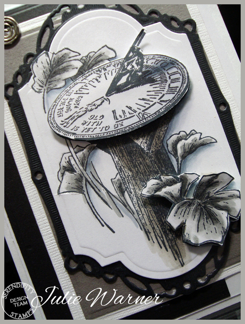
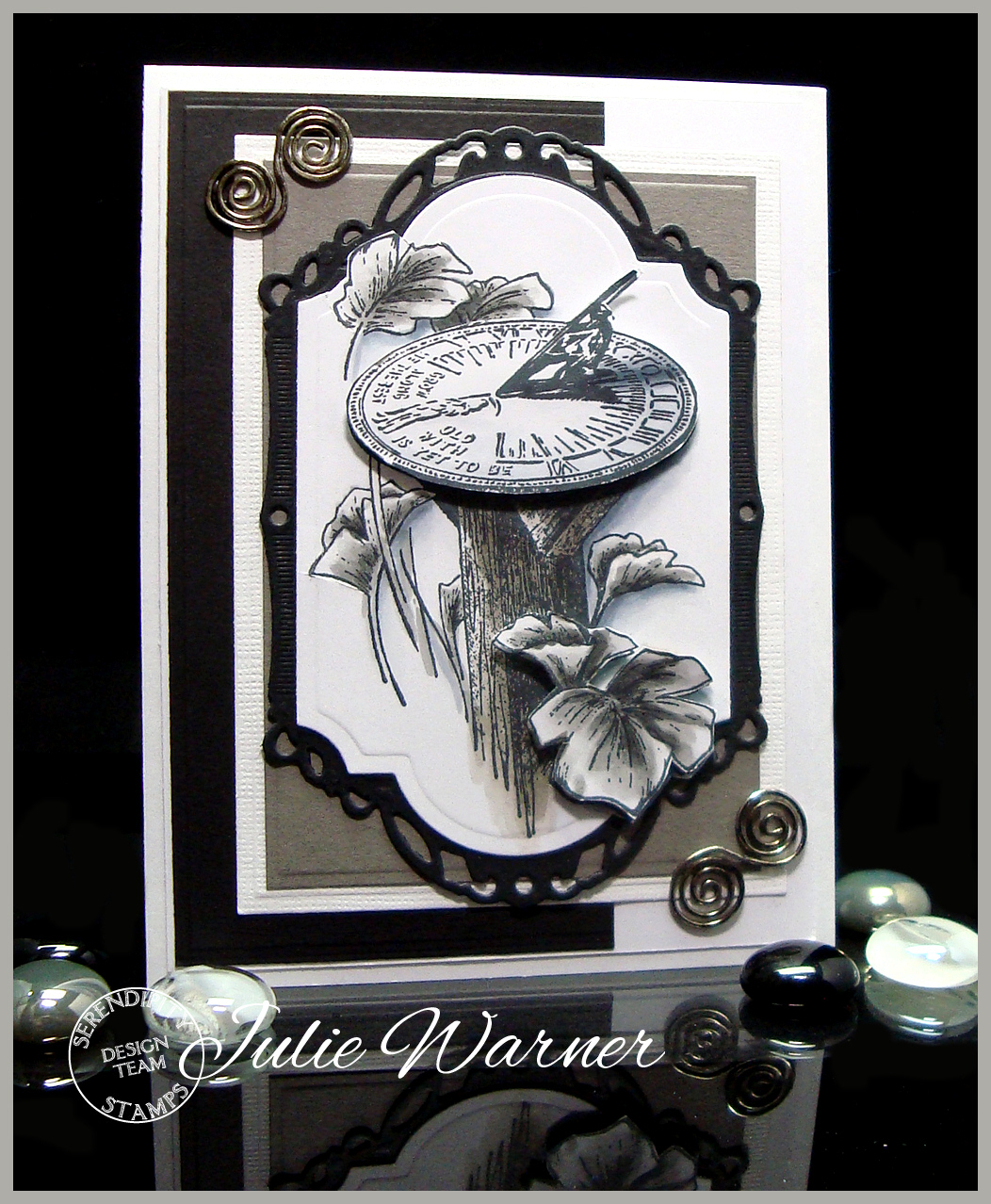
    For the design team, we have the added challenge of using something that describes part of our personality. So…with that in mind, I was immediately drawn to this fabulous sundial image. Now the shades of grey is not really descriptive of me, as I LOVE color. So that what the challenge part for me. But the sundial really spoke to me. Why? Well, not many people know this, but I was born during a total solar eclipse. Weird, right?  Growing up, one of my best friends was born on the same day, but a little earlier in the day. And I’ve always been drawn to astronomy, the stars and the heavens. So an image of something that tells time by the light of the sun really speaks to me. What would it look like during an eclipse? Maybe these shades of grey.

    Julie Warner - https://thewritestuff.justwritedesigns.com
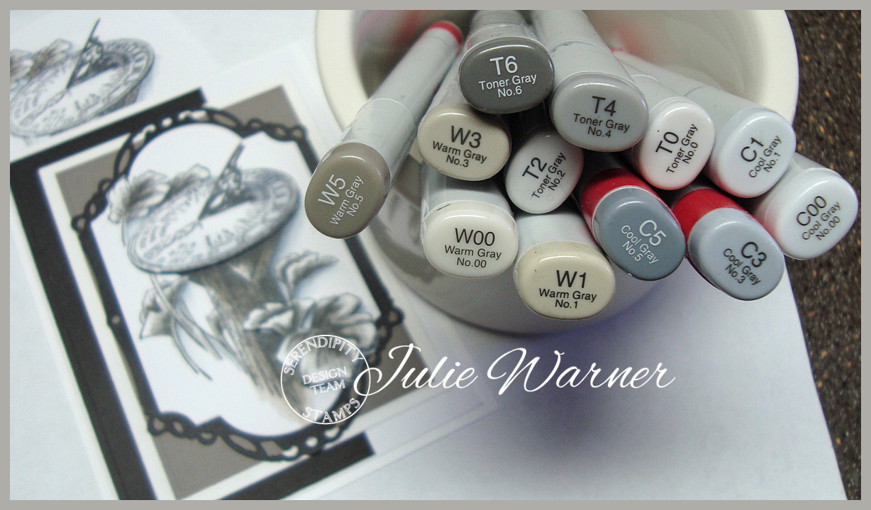
    After I stamped my image, I used the toner greys to color the leaves, the cool greys to add the shadows and the warm greys to shade the wooden post. I stamped an extra top to the sundial and the leaves in the lower right corner, colored them and fussy cut them and added them on top of the base image. The base image was die cut along with the black layer underneath. I used some warm grey, black & textured white pieces I had that were leftovers to fill in the card. I came across some swirly silver metal clips from who knows how long ago, and I used a dark warm grey Copic marker to add a little “age” to them.

    The finished card is 4.25 x 5.50 and these are the Copics I used.

    Julie Warner - https://thewritestuff.justwritedesigns.com

    Thanks so much for stopping by!

    Supplies:Julie2 sig

    Stamps: Serendipity Stamps – Sundial
    Paper: X-Press It white,warm grey, black
    Ink:  Memento tuxedo black
    Accessories:  Copic markers, Spellbinders labels 28, decorative labels 28, A2 matting basics A dies, silver spiral clips

    Please be sure to stop by all of the DT blogs to read their stories!

    Karen Amidon
    Marybeth Lopez
    Miriam Napier
    Pauline Pollington
    Vickie Zimmer
    Anya Schrier
    (off this week)
    Jeanne Jachna
    Jenny Gropp
    (off this week)
    Julie Warner
     (you are here!)


  • Serendipity Tea Time Blog Hop!

    Julie Warner – https://thewritestuff.justwritedesigns.com

    Weekly-Favorite

    Tea-Time-Hop-Badge-1

    Welcome to the Serendipity Tea Time Blog Hop! 


    We know you’ll love these beautiful new Tea Time dies! The rose cut outs are just gorgeous and the shape and lines are fabulous. 

    The hop will run through midnight EDT, March 30, 2014. Just visit all of the Design Team blogs and one random winner will receive a $20 gift code off their next order!

    Julie Warner – https://thewritestuff.justwritedesigns.com
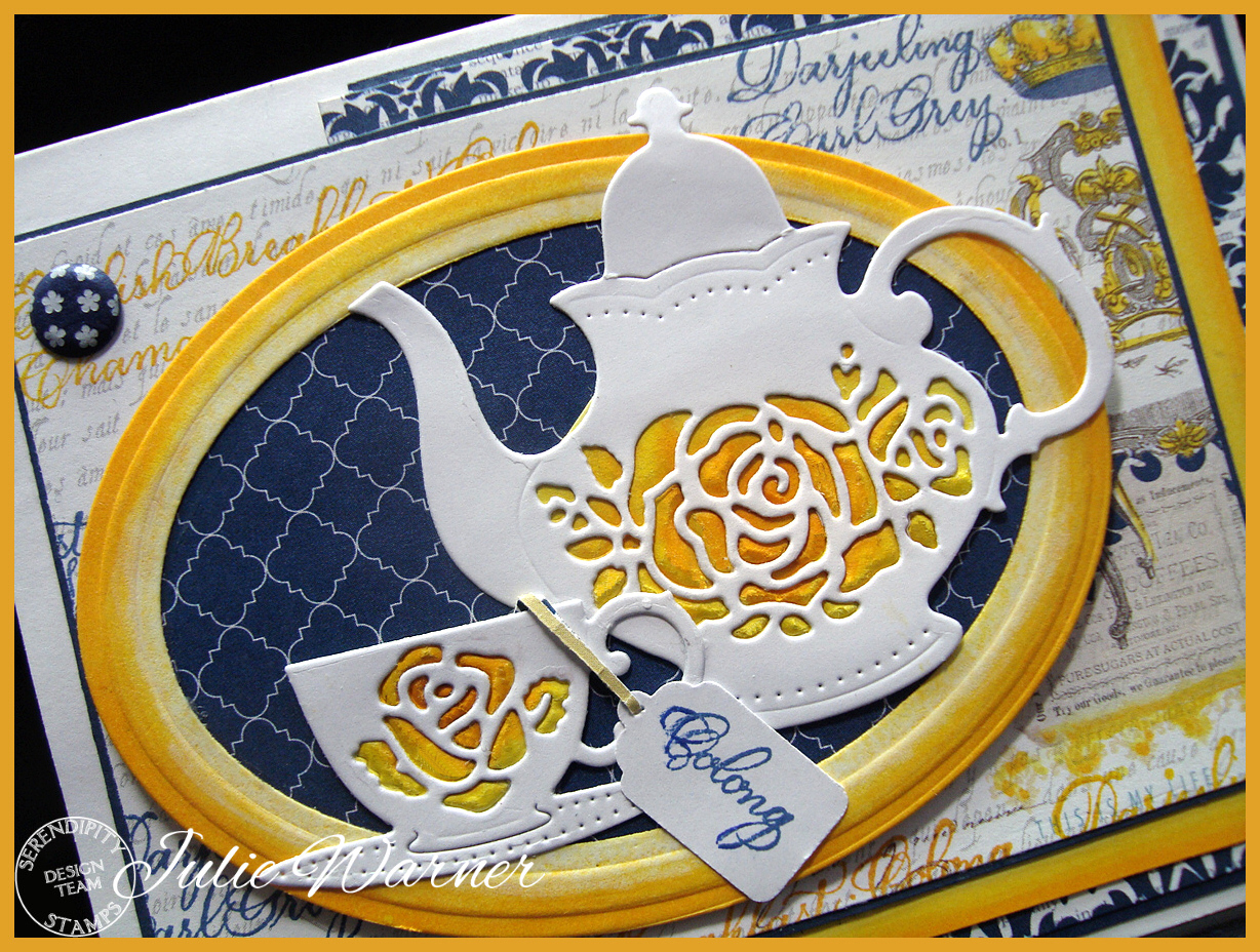
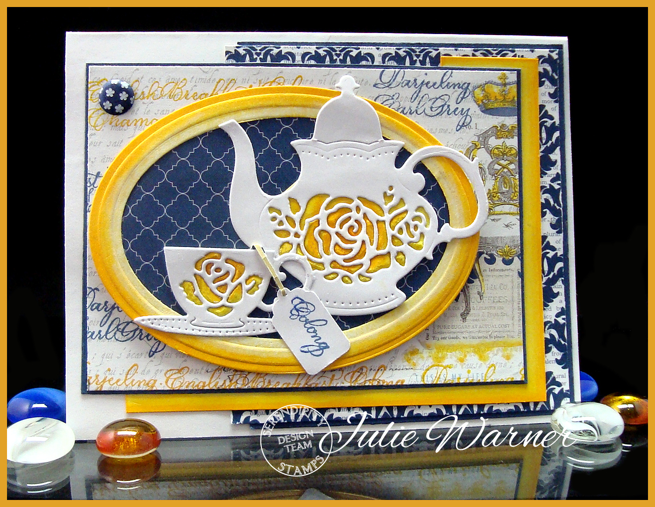
    For my card, I die cut the teapot & teacup in white, then lightly embossed them only on lt yellow card stock. I used yellow & yellow/orange Copic markers to add some additional color to the embossed yellow roses, then trimmed to fit under the white die cut versions. I came across a previously die cut white oval frame & used the same Copics to add color to match. I did the same with the larger, yellow/orange mat. The printed paper was added underneath for contrast. On the larger piece of designer paper, I stamped the tea border with the distress ink and added some of the yellow/orange color to it as well. The layout is a bit non-standard but I had some pieces of designer paper left from another project and didn’t want them to go to waste. One word of the tea border was stamped on white and I used a multi tag punch to punch out the one little “tea bag” tag to add to the cup. I added a printed navy Candi dot in the upper left for balance.

    Thanks so much for stopping by! Please stop by and visit all of the blogs so you’ll be sure to be in the drawing!

    Julie2 sig


    Supplies:

    Stamps: Serendipity Stamps – Tea Border
    Paper: X-Press It white, navy,  dp (Teresa Collins -Moments collection)
    Ink:  Memento tuxedo black, Distress inks in chipped sapphire, wild honey
    Accessories:  Serendipity Teapot & Teacup dies,  Copic markers, Spellbinders lg & sm petite oval dies. multi tag punch (McGill), Candi dot, Perfect Paper Crafts mini rulers & mat