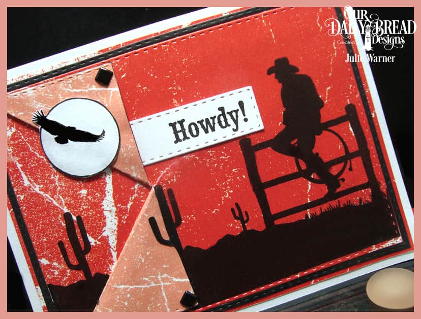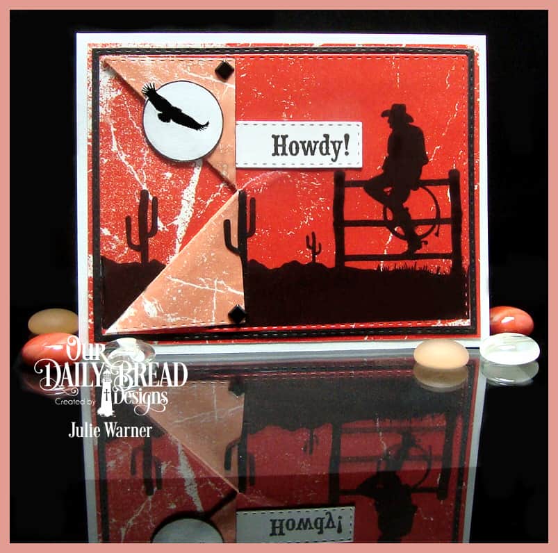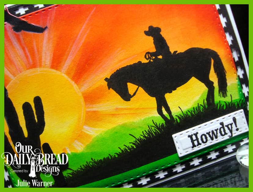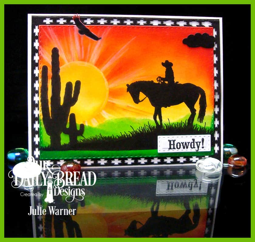


A big HOWDY to you & welcome to the Our Daily Bread designs May Mid Month Release! I tell you, this release is exactly what a Texas girl loves! And since that describes me to a T, I LOVE these! Not to mention how much you can do w/ a fabulous silhouette image.
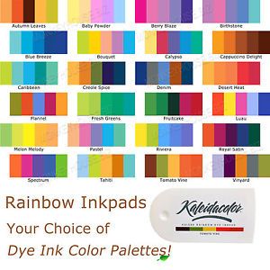
To start my first card, I knew I wanted a brightly sponged background, so I dug out a few Kaleidacolor ink pads. They have the most vibrant colors and that’s what I wanted.

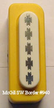
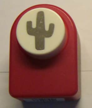
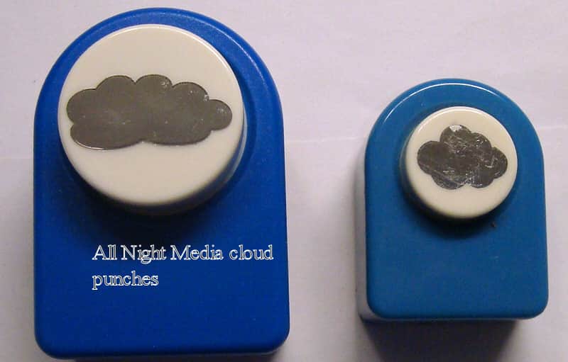
I used a a torn mask for the ground & sponged on the greens, reversed the mask & sponged on some yellow for the sky. Then I added a big circle mask & sponged on more yellow, some orange & a little red. I used the edge of the sponge to add the streaks coming from the sun, then highlighted them a bit w/ a white Prismacolor pencil. I put the bg into my Misti then stamped the silhouette cowboy, lg cactus & the eagle from the Bookmark Trees set. The small cactus & little cloud are punches. I die cut the scene w/ a Double Stitched Rectangle, doing a little out of the box for the eagle. The black background was done w/ a small border punch. I made a corner template out of copy paper & used it to help punch all around the edges and have it be as symmetrical as possible.
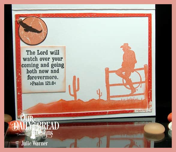
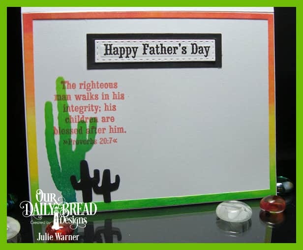
Here’s a look at the inside.

Supplies:
Stamps: Our Daily Bread designs – Howdy, Bookmark Trees (retired)
|
| Paper: Staples 110# white, black |
| Ink: Kaliedacolor inks Desert Heat, Melon Melody, Fresh Greens, Versafine onyx, (habanero -inside) |
| Accessories: ODBD Double Stitched Rectangles dies, Misti, cactus punch, SW border punch, cloud punch, white Prismacolor pencil |
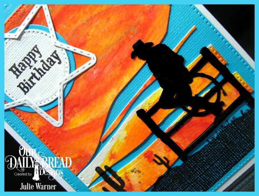
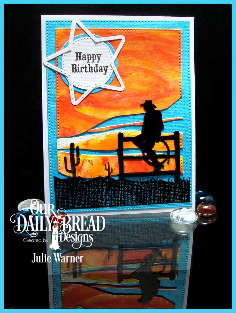
My second cowboy card started w/ pieces of a leftover watercolor bg. I liked the bright sunset colors w/ flecks of metallic gold & thought it might be fun to use them in a split background configuration.


Having them separated like this was very challenging to say the least. I placed them on top of the die cut turquoise bg w/ temporary adhesive & stamped the silhouette on top. Leaving the turquoise mat in place, I removed the orange w/c layer & stamped the silhouette again.

I liked the look the textured turq c/s gave to the ground area, but not so much on the cowboy. So I stamped him again on a separate piece & fussy cut him. Yikes! That was some fancy cutting, let me tell you! Then I had to go over all the cut edges w/ a black marker to keep them from showing. I added the greeting & big star frame to finish.
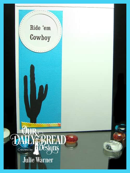
Here’s a look at the inside.

Supplies:
Stamps: Our Daily Bread designs – Ride ‘Em Cowboy
|
| Paper: Staples 110# white, black, textured turquoise, water color |
| Ink: Versafine onyx |
| Accessories: ODBD Pierced Rectangles, Pierced Circles, Circles, Sparkling Stars, Double Stitched Stars dies, Misti, Brushos water color crystals, gold acrylic paint |
Thanks so much for stopping by!

Please be sure to visit & comment on all the DT Blogs! It will be so appreciated & also increase your chances of winning!
Melissa * Julie * Sandee * Cathy * Dawn *
Lori * Robin * Chris * Angie
