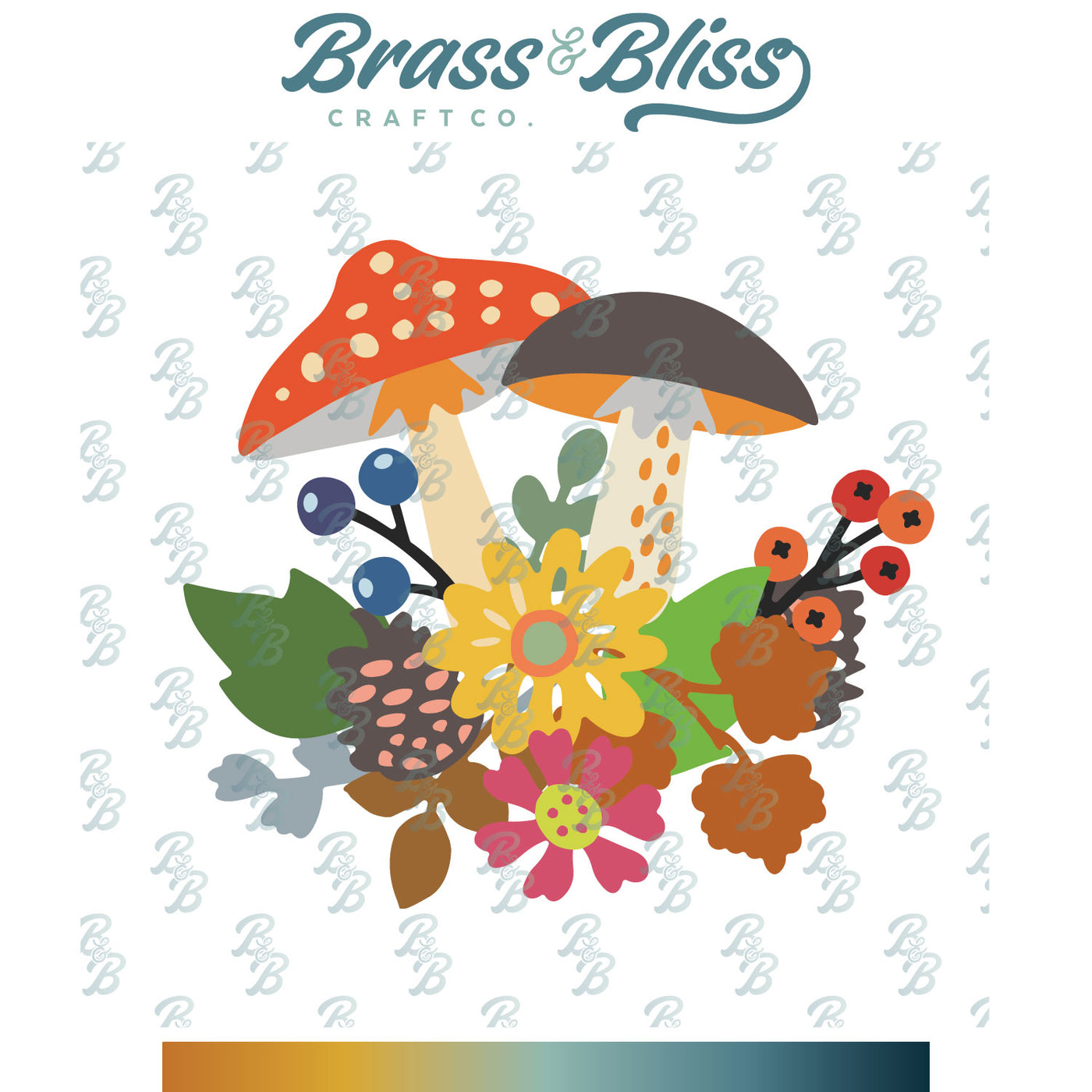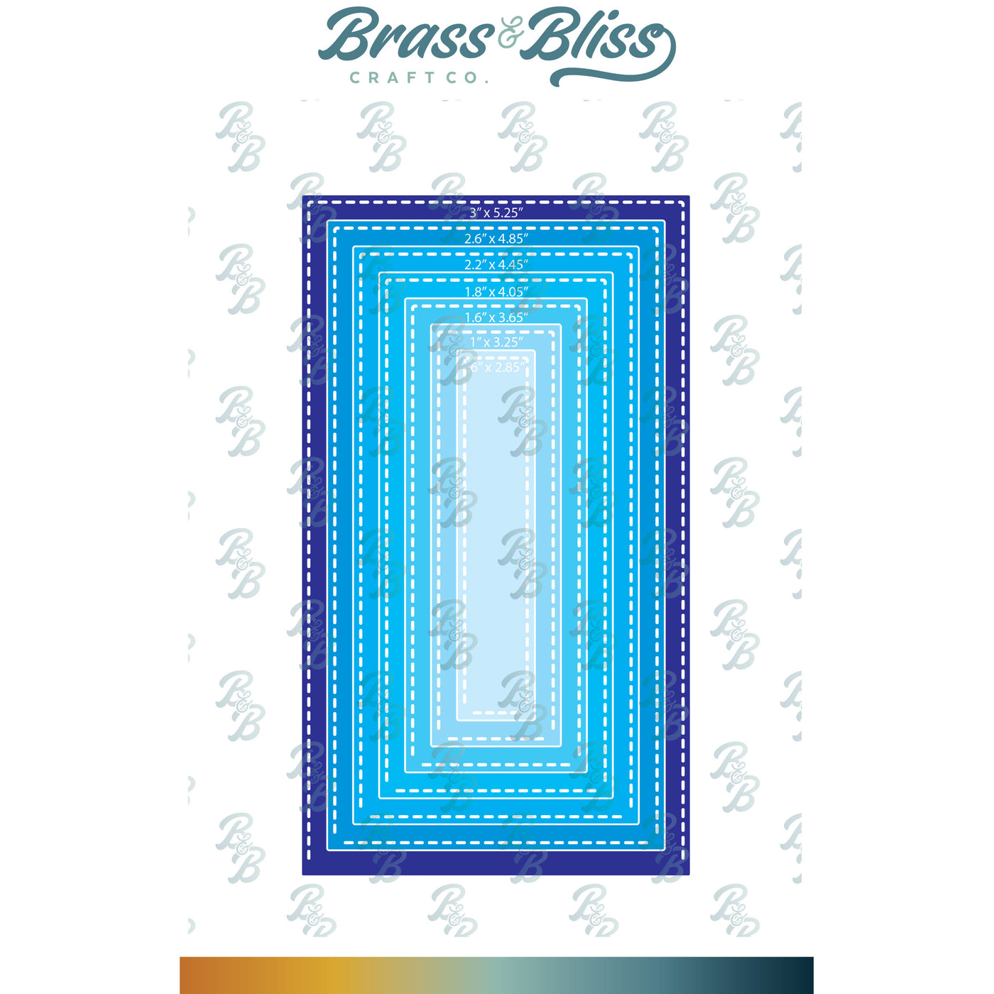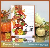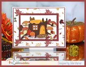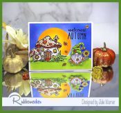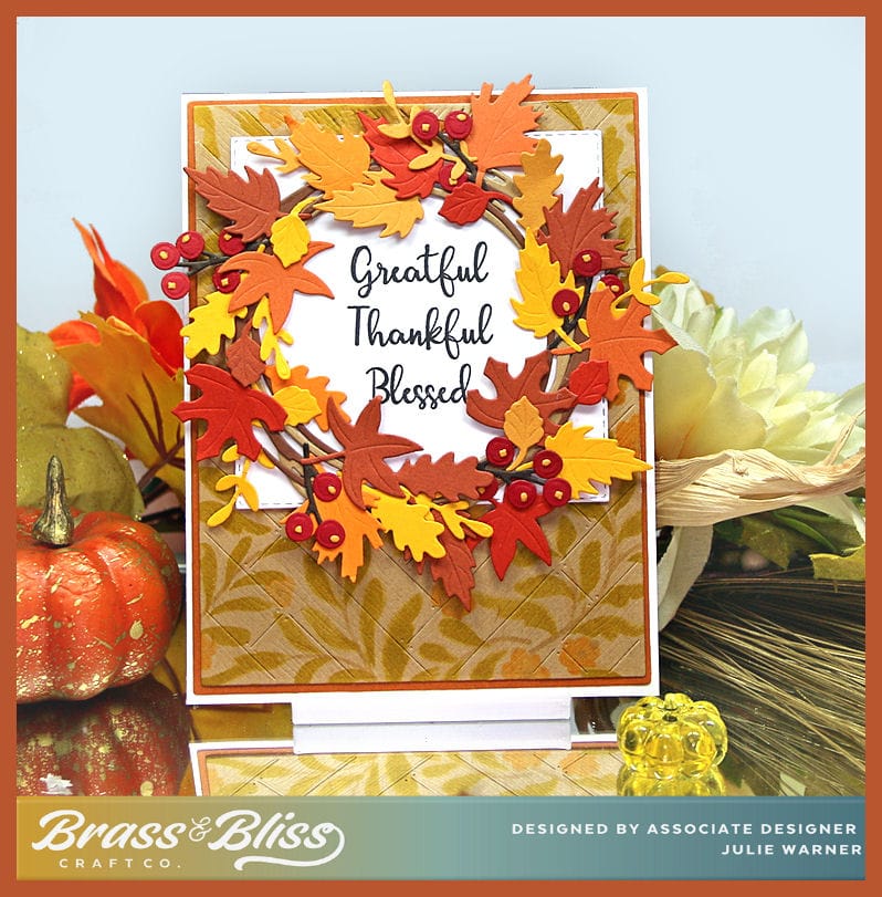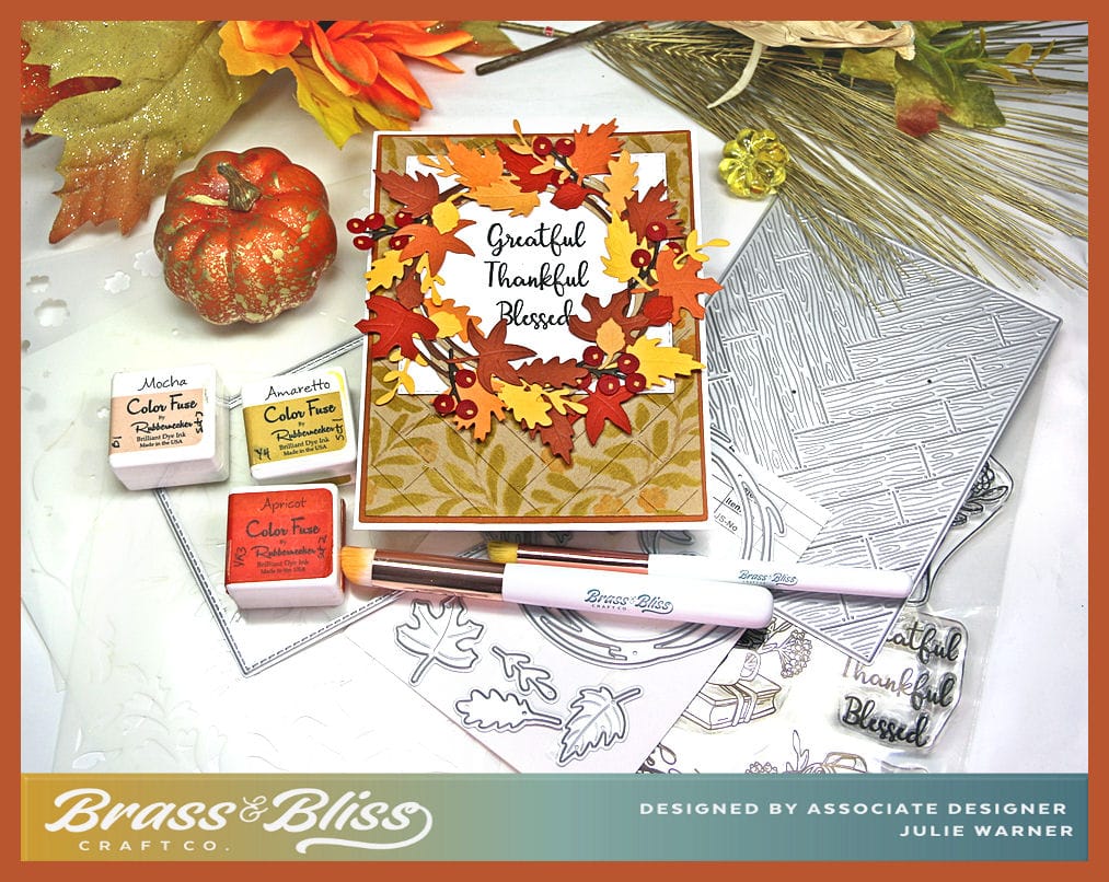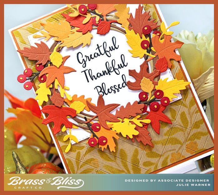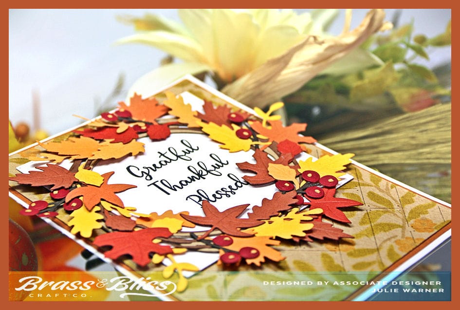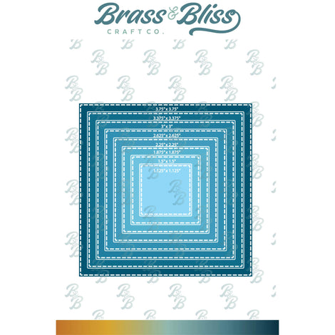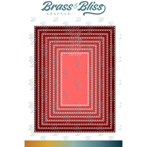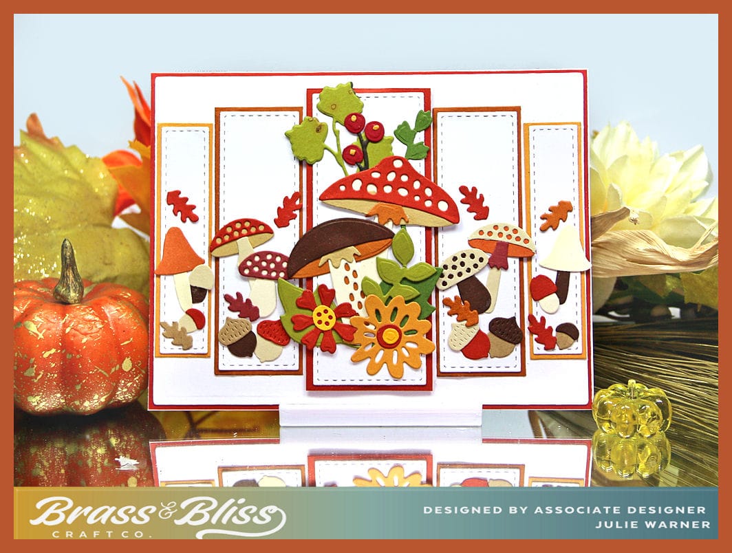

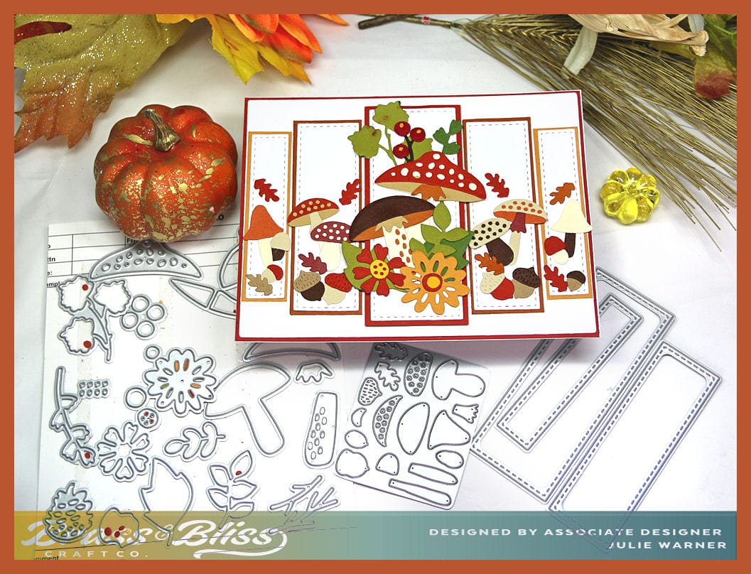
Today I have a colorful fall mushroom bouquet, spread out over layered narrow panels. This card was a lot of fun to make. Picking out the colors (a great way to use up small scraps) and then arranging the on the panels is all it takes. The new set of narrow stitched rectangles gave the panels a very sharp, professional look.
A big congrats to CJ, the newest Featured Stamper (FS927)! She has such a great gallery & I chose THIS card to case. I kept the line of panels in diminishing sizes, but I used different dies, different colors & didn’t use a photo.
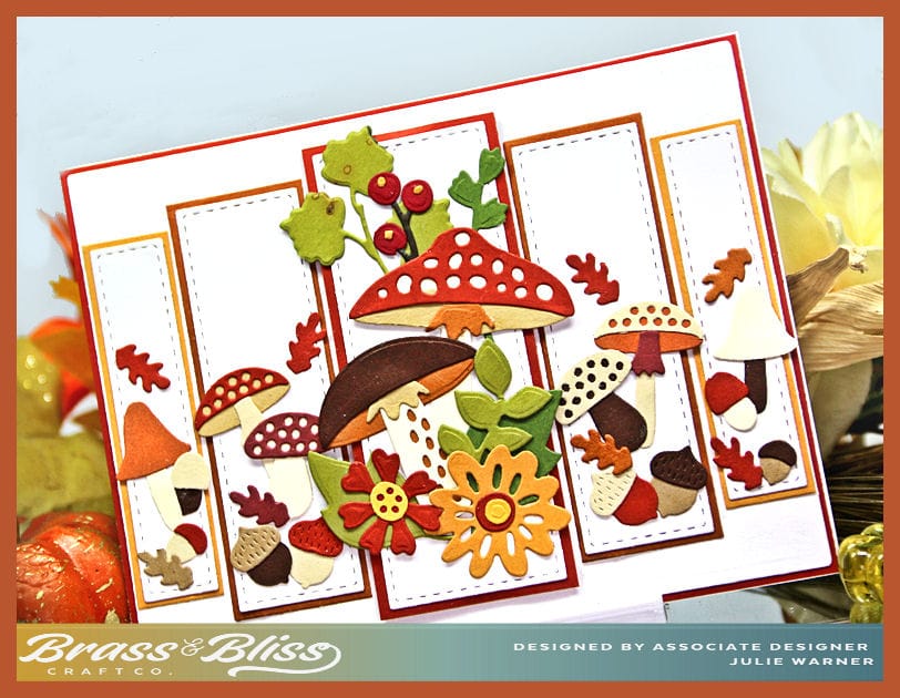
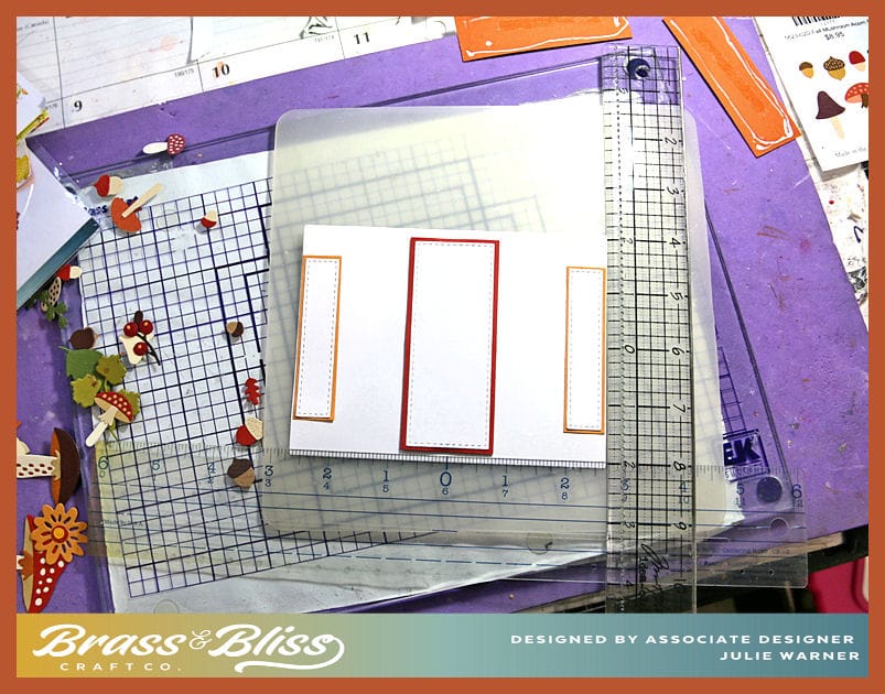
For my card, I die cut all the white panels, then cut narrow layers in 3 colors to back them. The center panel is popped up a bit & I have a tip for lining up panels like this & having them even. On the picture below, I used a centering ruler to place the middle panel. After finding the center on the white back panel & the center of the layered panel, I made a little tick mark w/ a pencil on both, then lined them up & attached the center panel. Then I put the ruler on the sides & found the centers there & attached the smallest panels on either side toward the edge. Placing the middle size panels was easy after that & I knew they would line up.
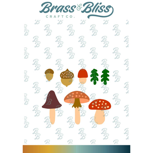
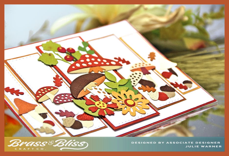
Then it was just a matter of putting all the die cut mushrooms together & arranging them. I used the big set on the center panel & a smaller die w/ mushrooms & acorns for the 4 side panels. I also added a very narrow dark rust layer behind the big white card front layer.
Thanks so much for stopping by!
Supplies: (click the names below the pictures to take you to the products)
| Stamps: Brass & Bliss: none |
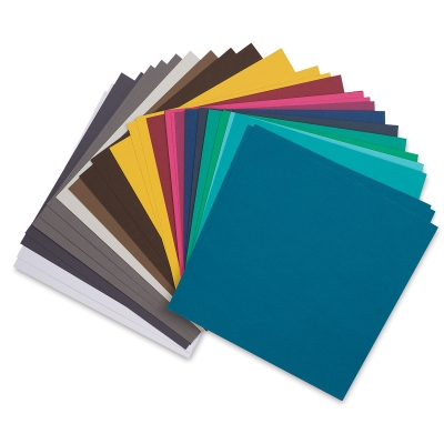
| Paper: Staples 110# white, kraft, goldenrod, rust, brown, clay, wine, autumn gold |
| Ink: none |
| Accessories: Brass & Bliss/Rubbernecker Stamps: Fall Mushroom Bouquet, Fall Mushroom Acorn, Narrow A2 Rectangle dies, Crossover II, centering ruler |

