
Welcome to the Our Daily Bread designs Special Anniversary Release Hop! We have some beautiful sets & gorgeous dies to show you…along with our brand new logo & watermarks! Things are looking pretty spiffy around here, don’t you think?

These new dies are so beautiful, I couldn’t wait to take them for a drive. The greeting sets have such gorgeous fonts & sentiments…they were suggested by our very own DT member, Grace, who is battling cancer, & she mentioned to Kelley, that sometimes you’d like to have something other than “get well” to put on a card. Something more uplifting & meaningful. I’m sure you’ll agree, all the sets are wonderful.
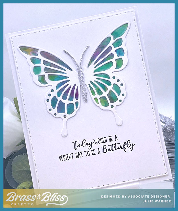
For this card, I started by making a series of watercolor washes across some watercolor paper. I only used the one color of pink, just varied the intensity. After die cutting the pink layers, I stamped the different dogwood blooms on the leftover piece & fussy cut them. The original Filigree Frame die is not the same on both ends, but it is symmetrical up to that point, so I die cut it to just past midway, embossed that section only, then turned the die around & matched up the already cut mid section, to cut the remainder & have the same look on both ends. Since my card is horizontal, it just looked more balanced to have it the same. (This is the same principal as die Resizing & you can see the pictures of that by clicking.) I used the Viva pen to add the little pearl drops on the frame & flower centers.

I get asked a lot what my watercolor backgrounds look like before I stamp or die cut them. Usually, I forget to take pictures of the “before”, but I remembered after I did the first set of die cuts. So I put them back in place to show you. And you can see, the middle (smaller) layer is cut out of the larger background (you can click any pic to make it larger!). When all the other layers are added on top, that missing piece well never show. Below it is a view of the inside..I only had that much of the watercolor bg left!


Supplies:
| Stamps: Our Daily Bread designs – Healing Prayers, Dogwood mini, (inside- Faith Card Sentiments) |
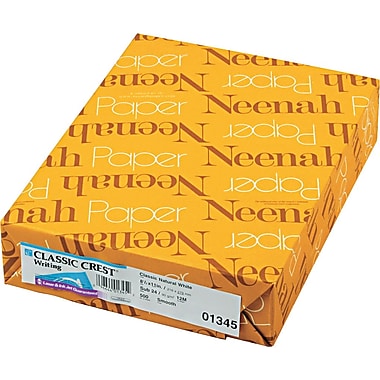
| Paper: water color, Neenah white |
| Ink: Versafine onyx, (Memento angel pink – inside) |
| Accessories: ODBD Lavish Layers, Filigree Frames, Flourished Star Pattern, Rectangles dies, Viva Pearl pen, watercolor pan set, Misti |

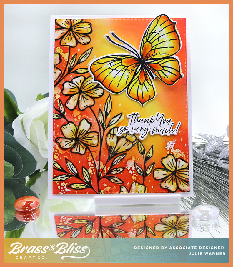
On my second card, I started w/ the two pieces of ODBD designer paper. I love the green pattern of the bg piece (from the Beautiful Boho pad), but I didn’t have a solid green that came close to matching it before the Boho Bold pad came out. Perfect! I die cut those layers using the largest Flourished Star Pattern die for the print & the largest Double Stitched Rectangle for the solid.

On the solid green, I stamped the Belles Vignes w/ white ink & heat embossed it w/ an off white sparkle powder. Then I die cut it using the next smaller Double Stitched Rectangle. The ivory die cut Lavish Layer covers the area where it was cut & allows me to use the smaller cut out on top of it.

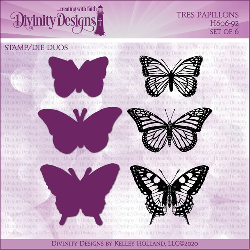
The wonderful Helen Keller quote was stamped w/ Versafine olympia green & die cut w/ one of the Rectangle dies. It’s matted on a Double Stitched Rectangle of the pattern paper & again on an ivory Lavish Layer. The butterfly was stamped on ivory w/ the olympia green ink, heat embossed like the bg & die cut w/ the matching butterfly die.
Here’s a look at the inside.

Supplies:
| Stamps: Our Daily Bread designs – Healing Prayers, Belles Vignes, Trois Jolies Papillons, (inside- Faith Card Sentiments) |
| Paper: ivory, dp (ODBD- Beautiful Boho, Boho Bolds) |
| Ink: Versafine olympia green, Colorbox frost white pigment (inside -Memento new sprout) |
| Accessories: ODBD Lavish Layers, Filigree Frames, Flourished Star Pattern, Double Stitched Rectangles, Rectangles, Trois Papillons dies, winter white embossing powder, Misti |
Please be sure to visit & comment on all the DT blogs..it will be so appreciated & also increase your chances of winning!
Julie * Sandee * Cathy * Dawn * Lori *
Robin * Angie * Chris * Grace * Lisa *
Sabrina * Melissa (Guest Designer)
Thanks so much for stopping by!


|

|

|
|

|

|

|

|

|

|

|
|
|

|

|

|

|
|

|

|

|
Wow just. wow
I love that you shared the watercolor wash photos too. Reminds me to try this technique again since it’s been a while.
Thank you for explaining how to resize/reshape the filigree frame, what a great tip! 🙂 Your cards are beautiful!
Absolutely Beautiful!! I LOVE the frames that Grace suggested, and LOVE the sets of stamps too! Beautiful water coloring, and both cards are just Gorgeous! Prayers for Grace!!!
Hugs
Cheryl
Wow, beautiful cards Julie!! I love all the pictures and showing your water color bg before. Great instructions! Beautiful addition of the little flowers under one layer on your first card and your sparkle white ep is so cool looking and pretty on the second card!
You are an inspiration
Your designs are elegant and inspiring. Thanks for sharing.
the watercolors are beautiful and your layering devine! awesome job!
Alicia
You know, I thought I loved the pink one, until I saw the green one and fell for that one too! WOW! These are lovely! Thanks for sharing!
Beautiful work on both of these. I love everything about them: the dies, watercolors and stamps.
Such beautiful inspiration! I really like the soft green color!
beautiful creations! Love the layered new dies!
I LOOOOVE the water color wash you’ve done Julie! AND also enjoyed seeing how you stretch your dies! 😉 Your green card is equally beautiful! I LOOOOVE the white sparkles on the green! SUCH A LOT OF WORK you’ve done on the layers!!! The new dies are GORGEOUS with these NEW WORDS & SCRIPTURES!!!! SO FITTING for this time in our world right now too!!! 😉
Wow….and wow. Exquisite cards, Julie. Thank you for your instructions. I love all of your cards, most especially the pink one. The new dies complement the sayings so beautifully. Thank you for sharing your awesome talent!
absolutely love the cards! Love, love, love the stamps. Praying for Grace daily!??
Wow, just beautiful! My favorite is the green! Thank you for taking the time to write so much detail on how you created both cards!
I pray for Grace. I know this must mean a lot for her. Your colors are so lovely on both cards. The dies are great. I especially love the Filagree Frame. Lovely watercolors.
Wow! You’ve showcased this awesome release in elegant style! Absolutely gorgeous Julie!
Incredible! Love the watercolor background & especially the heat embossing on the green.
Both of your creations are gorgeous Julie!! I love the pink and white on the first. The water coloring is such a gorgeous backdrop!! The butterfly and vines are beautiful!! Stunning designs, Julie!!
hugs,
Chris
Both cards are absolutely gorgeous, Julie! Thanks so much for sharing your water coloring and die cutting tips. Being able to alter the dies makes them so much more versatile. Very creative and beautiful, my friend. hugs!
WOW! WOW! WOW! My goodness these are so incredible!!!
WOW!! beautiful cards and beautiful dies and stamps
Breathtaking cards Julie! I especially love the pink watercolored one and the altered die cut. I was thinking of that too but did not get to it and it sure is beautiful!!! The green one is striking and perfect for today too! 🙂 The white embossing looks amazing against the green! Just beautiful!
Very pretty and elegant cards.
Absolutely love the colorwash background, raised center and the stamped flowers of card one. All combined to make such an elegant look. And the colors with the white of the second card are stunning. The message of this quote with the butterfly is so effective. Beautiful cards!
Absolutely gorgeous! The fancy fonts take the designs up to the next level.
These are absolutely beautiful. The dies are awesome and I love the fonts on the stamps. Thanks for taking the time to share all the details. Wonderful cards.
Oh so elegant and great cards! Love the colors
Beautiful cards, Julie! I love the new dies.
Beautiful cards!
These are absolutely stunning. There are just so many beautiful details on each card. Thank you for sharing your talent.
Beautiful watercolor. I love these selection of bible verses in this collection.
Beautiful, Julie!! So elegant! Great design inside and out!! Love the watercolor wash!
Your pink colour wash turned out nice, as did your card. Love all that layering.
The details on these are so amazing Julie, I love that you did the pink one on watercolors.
Wowza, girl!! Both of your cards are amazing!! Teehee, I love that you shared the secret of harvesting the paper from underneath the layers….I save tons of designer papers by doing that! I love the pink watercolor wash and elegant layers on the first and the green with the sparkle powder on the 2nd is super stunning! Fabulous job on both!! HUGS!!
So pretty. Love the pink. Love the intricate dies and the fact that they are made to match these lovely sentiments. Hugz
Love your elegant cards! I especially like the watercolored background on the pink one. ~ Andrea
Beautiful, beautiful cards! I always love seeing the “secrets” behind the scenes!
Love the colors on these cards. They are beautiful.
Your cards are gorgeous—-in fact, it’s hard to believe that ink and paper can be so beautiful. This is a special set for a sweet lady. My prayers are with Grace.
Both cards are so beautifully done!
Beautiful Julie! The watercolor wash looks fabulous as your background and the bottom card is very striking!
Your cards are gorgeous! I especially like seeing how your cut a panel from the middle of your back panel. Very clever and saves paper. I’m going to start doing that.
Julie, these are such special cards and I love each one. The pink card is so pretty with the watercolor effect. I love the sparkle on the green card!!