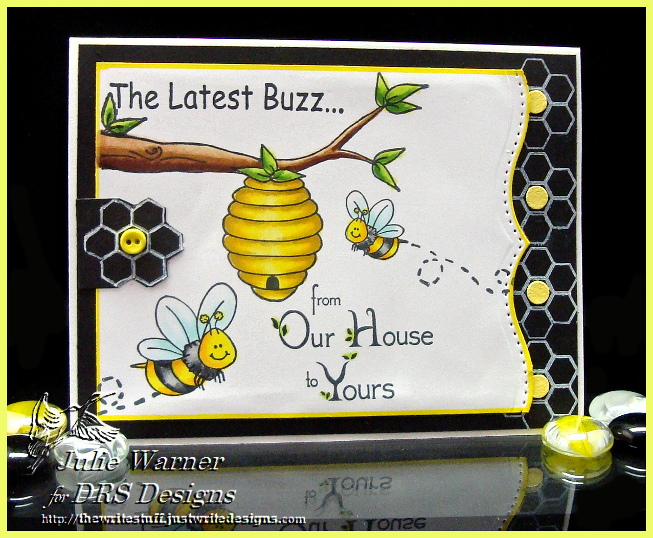
Another congrats to Nancy, the newest Featured Stamper (FS387)! Such a wonderful gallery and I had my eye on THIS card of Nancy’s. I kept the cute bee theme and colors, but I used different images, a different layout and omitted the sequins and banners.
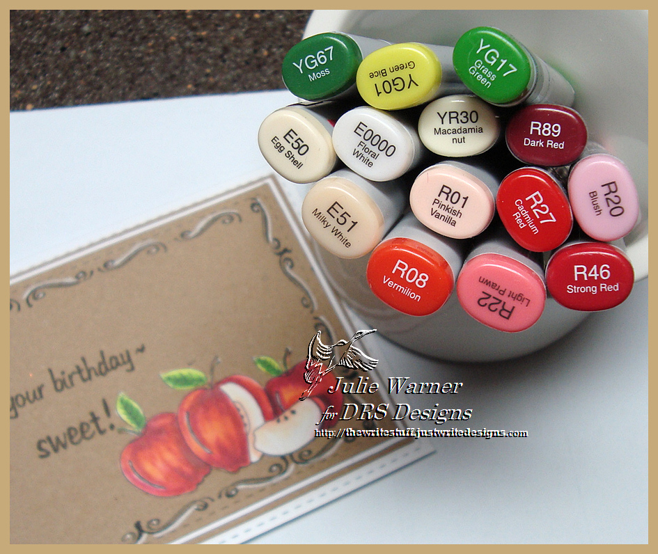
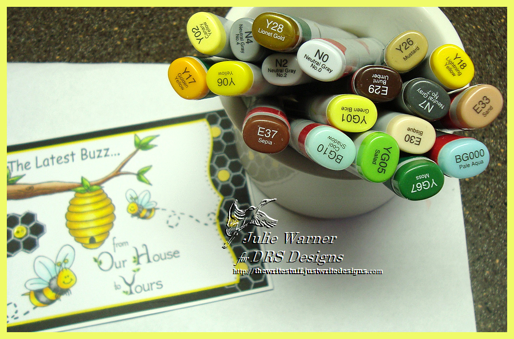
After stamping the hive, bees & two greetings, I colored them with Copics and die cut the right edge then edged the whole panel with a bright yellow Permapaque marker. I stamped the honeycomb a few times down the right side of a black panel using white ink then added some small punched yellow circles in the center. I stamped one extra honeycomb, cut it out and added a little yellow button in the center. These are the Copics I used to color everything.
Thanks so much for stopping by! Congrats again, Nancy! ! If you haven’t yet, please check out the DRS Thursday Challenge. This week…Pennants, Flags & Banners! DRS images are not required, so head on over!

Supplies:
| Stamps: DRS Designs –Beehive, Bee Trail, Bitsy Bee, Happy Bee, Honeycomb Design, Latest Buzz, Our House to Yours |
| Paper: X-Press It white, black, small scrap of yellow |
| Ink: Memento tuxedo black, Colorbox frost white pigment |
| Accessories: Copic markers, Spellbinders bracket border dies, hole punch, small yellow button, yellow Permapaque marker |