• Category Archives Splitcoaststampers Weekly Favorite
  • Splitcoast Challenges » Splitcoaststampers Weekly Favorite
  • ISC April Inspiration Challenge

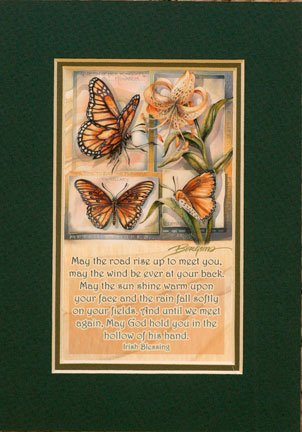
    This month, ISC has an Inspiration Challenge for you! Betsy chose this wonderful picture for the inspiration piece. Don’t you just love the colors and images? Want to win a free sheet of ISC images? To be eligible to win, use the picture as your inspiration and create a card or other project using ISC images only, and link your creation to the ISC Blog by May 9th.


    Weekly-Favorite

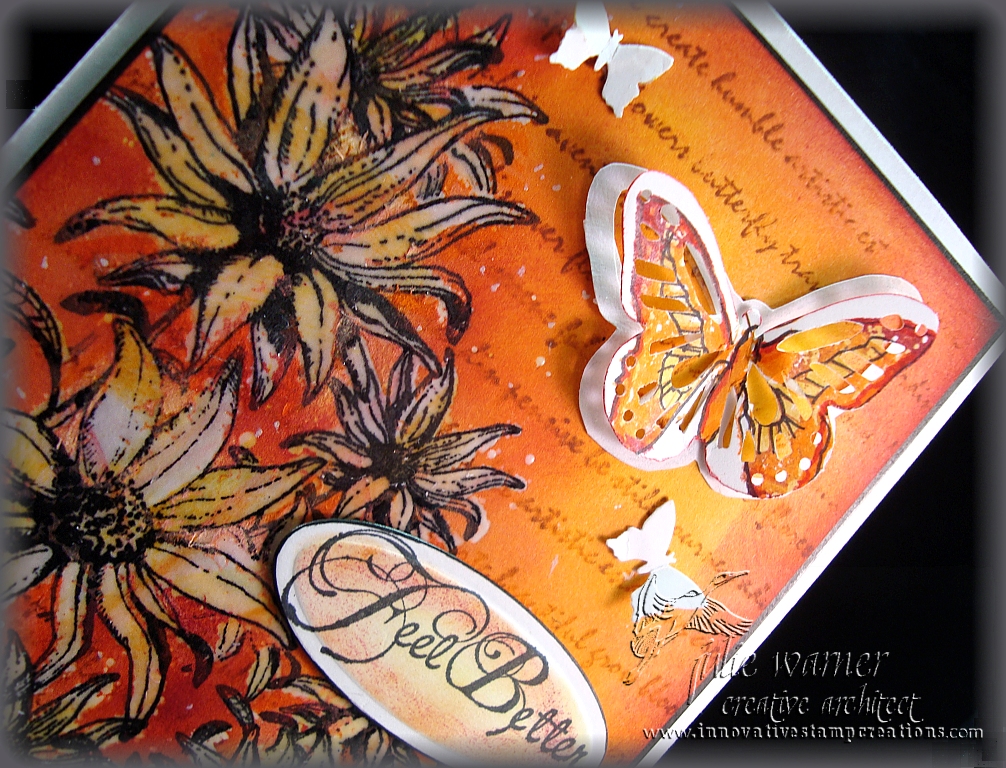
    And this is my version. I really picked up on the orange colors, the flower and butterflies. Although it may look like there are layers or cut outs, there’s really only one layer attached to the card, three punched butterflies and one die cut sentiment. I started with a piece of white c/s slightly smaller than my 4.25 x 5.5 (A2) white card. I stamped the medium and small Bush Flowers with black ink, masking when needed. I added just a touch of color by lightly swiping sponges w/ yellow, orange and pink inks haphazardly across the flowers. I colored over all of the petals w/ a VersaMark pen and clear embossed them. A few specks of embossing powder were spread out around the flowers, but I like the splatter look so I left them and even added a few more.

    Yellow, orange, pink, ginger and cranberry inks were then sponged over the entire piece and I used more of the darker colors around the flowers to add more contrast. The excess ink was wiped off of the clear embossed flowers. The script from Odd Findings was stamped over the top with ginger ink.  I stamped a butterfly from  Friends are Special using the yellow, orange and cranberry inks on a scrap of white then I used a butterfly punch. The punch didn’t exactly line up w/ the image, but I like it anyway.  I traced around it on a piece of white and cut the inside out, leaving just a white frame of the butterfly. I used this as my base to attach to the card and popped the butterfly up on top. I added two more small punched white butterflies and the sentiment (also from Bush Flowers). I edged the entire piece w/ a black marker and added a piece of cardboard underneath for a little dimension before attaching it to my card.

    Thanks so much for stopping by! Your comments are always read and much appreciated!

    Be sure to check out the rest of the ISC Architect’s creations. Links are on the side bar. ———————>


    Julie2 sig

    Supplies:
    stamps: Innovative Stamp Creations
    paper: white
    ink: Ancient Page coal, Adirondack ginger & cranberry, Stamp It orange & pink
    accessories: black Permapaque marker, Martha Stewart monarch butterfly punch, small butterfly punch (All Night Media), Spellbinders mega oval set
     

    SaveSave

    SaveSave


  • Mystique – FS168

    Mystique - https://thewritestuff.justwritedesigns.com/

    Weekly-Favorite

    Congrats to Gloria (GloriousGreetings) , the Featured Stamper today at Splitcoast.  I picked a couple that I want to case and this is the first one. I chose her Heartfelt Sympathy for this one. I kept the brayered background, silhouette images and big main panel, but I changed the colors, the images and added another layer.

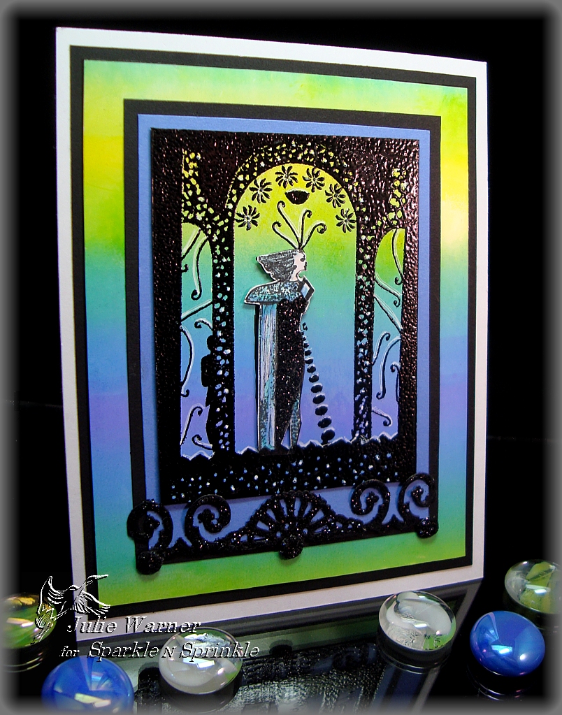
    All images, embossing powder, adhesives and glitters are from Sparkle N Sprinkle. After doing a brayered bg on a 1/4 sheet of white glossy c/s, I used the static pad and stamped this great Art Deco image in the center of the panel  w/ black pigment ink and embossed it w/ black ep. Sometimes I’m asked why I don’t use clear ep w/ the black ink or black ep w/ a clear ink. Almost exclusively, I use an ink very close to the color of the ep I want to use because it gives me a much deeper color. It also hides any flaws like when a tiny portion doesn’t get the ep. I stamped the lady portion of the image again on a scrap of  matte white c/s using black permanent ink. On this image, I used markers to color her, cut her out and applied glue and black glitter to her dress. Then I attached her to the base image w/ a little card board under her to give her just a little lift.

    I used a craft knife to cut the base image along the straight sides because I used the rest of the bg for my big layer. Some highlights were added w/ a white gel pen and  lavender and black layers were added underneath before attaching it over the main bg. Another black layer was added then everything was attached to a 4.25 x 5.5 (A2) white card. I used a Cuttlebug ornamental border die to cut the black scroll element, brushed glue over it and coated it w/ black glitter before attaching it below the image. I made 3 faux brads and coated them w/ glitter as well.  If you’d like to see just how I make these nice rounded brads, I just finished a new Faux Brad Tutorial. I’d love for you to check it out!

    Thanks so much for stopping by! Your comments are always read and much appreciated!
    Julie2 sig


    Supplies:
    stamps: Sparkle N Sprinkle
    paper: white, white glossy, lavender(this is actually a clone of Ballet Blue, it just looks lavender next to these colors), black
    ink: Colorbox black pigment, Ancient Page coal, Tsukineko Kaleidacolor pad in Riveria
    accessories: brayer, static pad, embossing powder & glitter (both SNS), Cuttlebug ornamental border die, brushable glue and glue pen (both SNS), 1/4 inch hole punch and stylus

    SaveSave


  • April ISC Day 2


    Weekly-Favorite

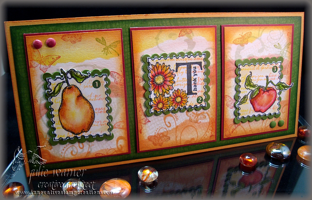
    On Day Two of the ISC Artistic Projects, we were challenged to make a card using 3 ATC’s in a connected series. I chose to use the fruits and flowers along with the postage stamp outline. To begin, I temporarily attached all 3 ATC’s side by side to a piece of paper. After stamping and masking the images, I stamped a script using one end of a Kpad. I colored the images using markers and a blender. To cut them out, I first cut a straight line very close to the wavy edge then used an 1/8 inch hole punch to make the cut outs along the edge. They’re attached to a green layer I cut using a Spellbinders scallop edge square. I used my Nestie Resizing technique to stretch the die to fit my image.

    For the background of the ATC’s, I stamped various butterfly, netting and swirl images then masked areas and sponged on bands of color. They’re attached to slightly larger layers of red then to a green layer that was stamped tone on tone using some of the same images. It’s attached to a  6.75 x 4.25 gold ochre card. A little bit of an old size, but it will fit inside a #10 business envelope. I used a 1/4 inch punch and a stylus to create some red and green faux brads and attached them in opposite corners.

    If you’d like a chance to win an ISC sheet of images, be sure to leave a comment. You don’t have to leave a comment on every blog, every day, but doing so could increase your chances of winning. You can also leave a comment on the ISC blog, if you like. Two winners will be chosen from the comments received over the next 3 days to pick an ISC sheet of their choice.

    I hope you enjoy all the ISC team’s projects. Be sure to come back tomorrow for more ideas and inspiration.

    Thanks for stopping  by! Your comments are always read and much appreciated!


    Julie2 sig
    Supplies: stamps: ISC- for the apple and pear: Fruitful, for the script, the numbers, the postage stamp frame and little butterfly: Odd Findings, for the greeting: Nature Silhouettes I,  for the netting bg: Background Series Netting, for the little flowers and other butterflies: Make a Note
    paper: white, red, green, gold ochre
    ink: Ancient Page coal, sunburst,  lemon peel, leaf green,  Memories soft leaf, Kaleidacolor pad Melon Melody
    accessories: 1/4 and 1/8 inch hole punches, Spellbinders square scallop set, markers and blender


    SaveSave

    SaveSave