 Welcome to our Not so Macho Masculine Blog Hop brought to you by the Sparkle Team of Sparkle N Sprinkle!
If you arrived here from Barbara Bruder’s blog, you are in the right place! If not, you’ll probably want to go to the SNS Blog and start from the beginning.
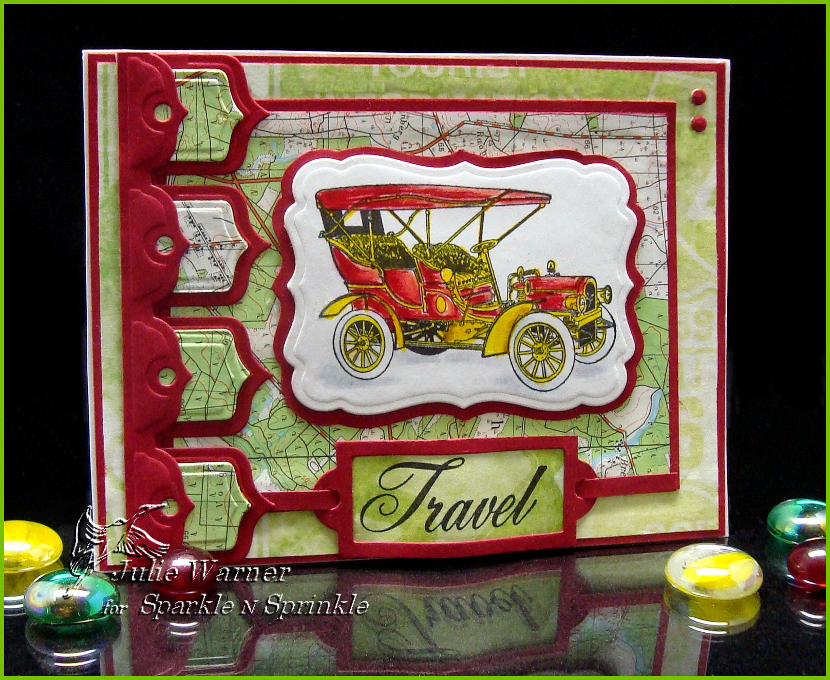
I’m going to share two different cards made using the same set, 1900 Cars set 285. For the travel card above, I used two different map papers, a new banner die set and labels 17 from Spellbinders. The antique autos on both cards were colored using a combination of markers and Prismacolor pencils. For the Travel greeting, I used a bookplate die and bowed it slightly when I attached it.
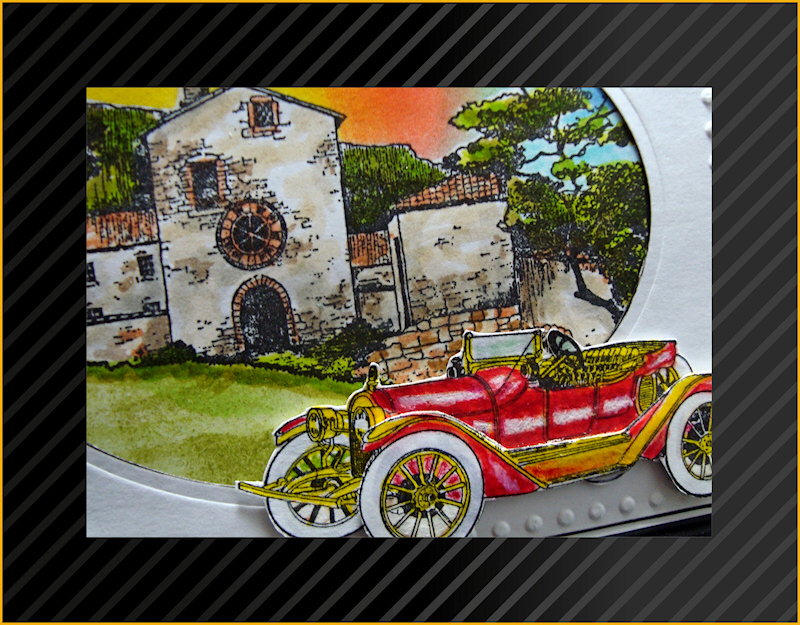
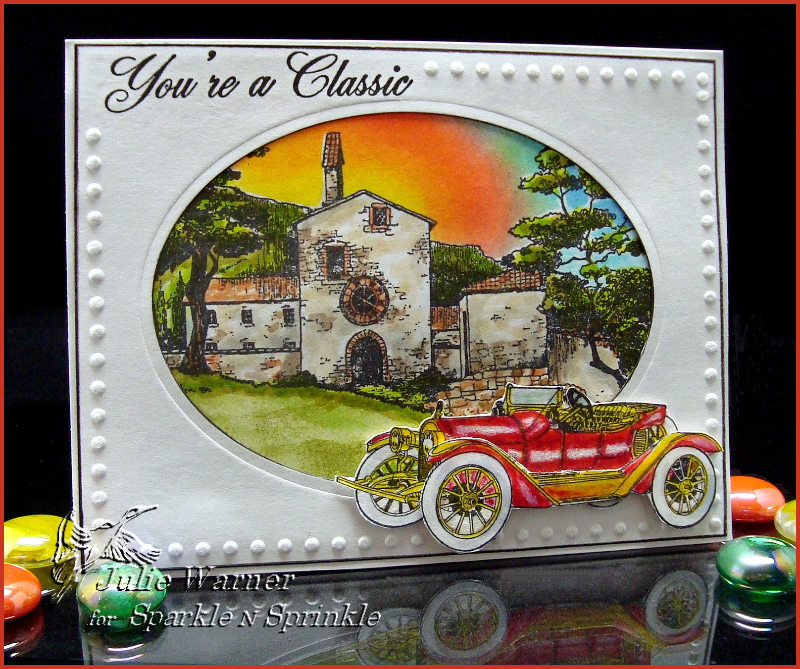
On the Classic card below, I cut out the roadster and also an extra left side (facing the viewer) and layered it on the base image for a little extra dimension. The background scene was stamped, masked, sponged and then colored w/ markers. The white frame used a lg oval Spellbinders die and a dot border embossing folder which I used a stylus to hand emboss around the frame. Both cards measure 5.5 x 4.25. The Travel and Classic cards w/ full instructions are also on the SNS website.
Your next stop will be Jill Jacobson’s Blog, so hop on over! By the way, the product you can win from my blog is a jar of Berry Pudding Glitter Tinsel. If you haven’t tried it, please check it out. It’s fabulous! And this color is just scrumptious! Thanks so much for stopping by!
Supplies:
| Stamps: Sparkle N Sprinkle – 1900 Cars, Scenery set 349 (for Classic card) |
| Paper: Neenah white, dk red, 2 different designer/map papers |
| Ink:VersaFine Onyx, Kaleidacolor Melon Melody, Desert Heat & Riviera rainbow pads |
| Accessories:White gel pen, Prismacolor pencils, Tombow Markers, 1/2″ Double Sided “Tear-ific” Tape SAT04, 1/8” Tear-ific Tape SAT02, Spellbinders Labels 17, petite ovals & Banner Basics 2 dies, Sizzix bookplate die, Cuttlebug dot border embossing folder, stylus, sponges, Stamp-a-ma-jig (SAMJ) |
More challenges for this:
Stamps R Us – masculine
SCS WT322 -trees, SCS FS223
Kaboodle Doodles – lots of layers
Cards for Men – someone special
Tuesday Throwdown – die cuts
Timeless Tuesday Challenge – anything goes!


Julie, the colors on your cards are amazing! Always such intensity! Love how you always have great tips, and useful ideas for using the art supplies already in our stash.
Nice cards. I love the colors.
Thanks for making great cards for the blog hop, Julie!
These cards blew me way, Julie. Absolutely gorgeous! love your color sense and dimensionality. Great job!
Be still my beating heart! I love what you did with both cards — the Spellbinders on the first are used in such a creative way and the background on the second makes me want to jump in there and go to that place! Wonderful coloring~!
AMAZING! Your attention to detail and color is UNMATCHED, girl. Beautiful beautiful beautiful!!!
Love the bright colors in the backgrounds and your coloring is awesome! Great card Julie!
Julie, I love what you did with these two cards. The coloring is spectacular and the tabs on the first card really makes it stand out!
Julie, your coloring on the second card is truly breathtaking. Thank you so much for your inspiration today. I adore you and your work!!!
These cards are absolutely fantastic. Your artist ability just ‘SHINES’…what an inspiration you are!!
Absolutely beautiful cards Julie your work is always awe inspiring
Amazing artwork. This is too beautiful to just be a “card.” Would totally frame this and display in my home!
Your cards are so wonderful! I love the idea of the scene behind the car. Great idea and your coloring is magnificent!
Wow! You do beautiful work!
Wow! You do amazing work!
OMGoodness … I am totally visualizing me in that vintage car driving around the Cinque de Terra area of Italy … warm summer breeze blowing my hair with my man by my side! These cards are absolutely fabulous. Thanks for sharing.
Fabulous pair of cards, love the images on them both. Thanks for joining us at CFM, good luck with the Challenge. with hugs Shirleyx
Julie, Such fantastic cards! Love the car images offset by your two, so different, yet incredible backgrounds. Great way to make the images stand out! Great suggestions and ideas you have given us, to say nothing of inspiration! Wonderful. Thanks.
These are most definitely the finest cards I have seen thus far!
the time and effort you have put in to both of these shows just how inspired you are and how serious you take your work.
classic or travel – classic is phenomenal but travel is so good as well.
cannot decide which one so you are twice a winner with me!!
wow! your coloring is stunning, so vibrant and the layouts are fantastic!
In your first card, the colors, the dies used make a very STRIKING CARD!!! Impressive! Your second card gives the impression of quiet dignity and very neat!!!
WOW! Being a Spellbinder fan, I love all the diecuts on your cards. I especially love the first card. It has wonderful texture. But then again, the diecut “window” on the second card is wonderful. I guess I’m hopeless – I like them both and don’t was to choose one over the other!
Love both of your cards Julie. Having lived in Italy – they just took me home (well the car was a little older – but you know what I mean!)
Really love your cards, they are gorgeous designs and wonderful images. Thanks for playing along at Kaboodle Doodles this week. Jill
Your second card is really great! It looks like it’s right out of a movie, with the old building in the background!
Oh Wow I have that building and love it, never thought to do this with it though. Thanks so much for the ideas. Beautiful cards.
Julie, you are amazing!! I’m absolutely LOVIN’ that oval card. The white, the bright inside, the dot border… You are the master and I bow before you!
Both of your cards are oh, so elegant! I love the way you used the banner dies on the first card. Your coloring is spectacular, especially on the second card. That scene is alive!
Beautiful cards! I really love those old cars!
I especially like your second card with the cut out roadster on the lovely background.
Julie these are awesome. Your coloring rocks and I like these vintage cars.
WOW!!!! These are just sensational!!! GORGEOUS cards and your coloring is fantastic. LOVE THEM!
Thanks for joining us at Stamps R Us Challenges.
Lynn
the 2nd card is so cleverly made with the map pieces etc tks Sandy
Julie I ADORE this, GORGEOUS work!!~
Both fabulous cards! Love all the die cut layers with the map background on the first card. The coloring on the second card is just fantastic.
Fabulous cards…so masculine. Love the vintage cars and wonderul scenes.
Julie, these are AMAZING! Your coloring is fabulous and the detailing and framing style are very striking! Lovely cards! Thanks so much for playing Flourishes FTTC Challenge!
O.K.: Card #1 uses my favorite color combinations and Card #2 uses my favorite stamps!! These are two really great ‘guy’ cards and the recepients will be very, very happy with your efforts!
Julie, Thank you for making these cards. They are inspiring. Men’s cards are not my forte, and these will help.
Candy Meyers
Pingback:“The Not So Macho Masculine Card” blog hop
Julie – again, I’m awestruck! AWESOME cards…. you fit so much into a small space & it never looks overdone – always just right!!! Brenda
Love your cards, gorgeous colours and images! Thank you for joining us at Cards for Men for my ‘Someone Special’ challenge, good luck x
Wow, wow, wow. Gorgeous. Amazing colors. Thanks for the inspiration!
Fantastic bright colors! Beautiful job of coloring!
Love both of your creations – I would never have thought to use those two sets together – yet they go together so well! Kudos!
Your drawing are stunning… they actually look like pictures. exceptional job on the coloring!
I love how you used the die set and map paper on the first card. I would like to know what die set it is. The card is awesome top to bottom. Great job.
Wow! great job on both cards.
All I can say is WOW. I am so impressed with both cards, the coloring, the style, and the techniques. TFS
Your coloring is so beautiful. Great cards.
Oh My these are beautiful. Thanks for the chance to win.
Both of your cards are fabulous — Love your colors!!
Very clever idea with the card cards. Great for men. Edna
Stunning. Love the bright colors on the first card. The second card needs to be framed! Beautiful.
Great cards as always Julie. The travel card has lots of great details & is so nice. I think I like the second one best though – such gorgeous colors & composition. Plus I love the dotted border on the card; just the perfect finishing touch. Beautiful cards Julie!
Just fabulous! I love the scene of the house — great coloring. The map idea is also great!
Julie, your cards are amazing! I love how you used the map as background. Very clever.
You’re cards are truly amazing. I love your use of Spellbinders and how you make the cards come to life. Wonderful and beautiful. Thanks, Charlene
Wow! Two amazing, eye-popping beauties! I love the symetry in the first card with the tags. I love the popped up outer part of the car in the 2nd one. Thanks so much for sharing your creativity!
Wow! With all the details, these must have taken you a long time!
I like having the map as background in the first card.
The second card makes me want to go and find someplace that looks like that.
Wonderful! These are so timely with the Chitty Chitty Bang Bang car up for sale!
Fantastic cards! The 2nd one is straight out of the New England countryside. Thank you so much for sharing.
Julie,Your cards are so gorgeous. I always love to see what you have designed. I love the use of the banner die cuts but I really love the second one. The car looks so great in front of the house. What a great card.
Julie your cards are beautiful. Great coloring. I want to try the cuttlebug dots like you did. Thanks for the inspiration.
All the nice eye candy! I have always loved the old cars, but on the cards! way to go. Everything just pops with color.