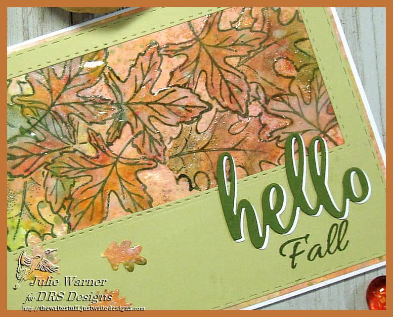
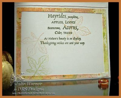
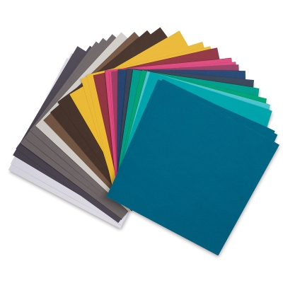
For today’s Color Challenge (CC759) on Splitcoast, the colors are mango, rose & pear. To be honest, these colors are not on my go to list & I don’t have these colors, so I came as close as I could.
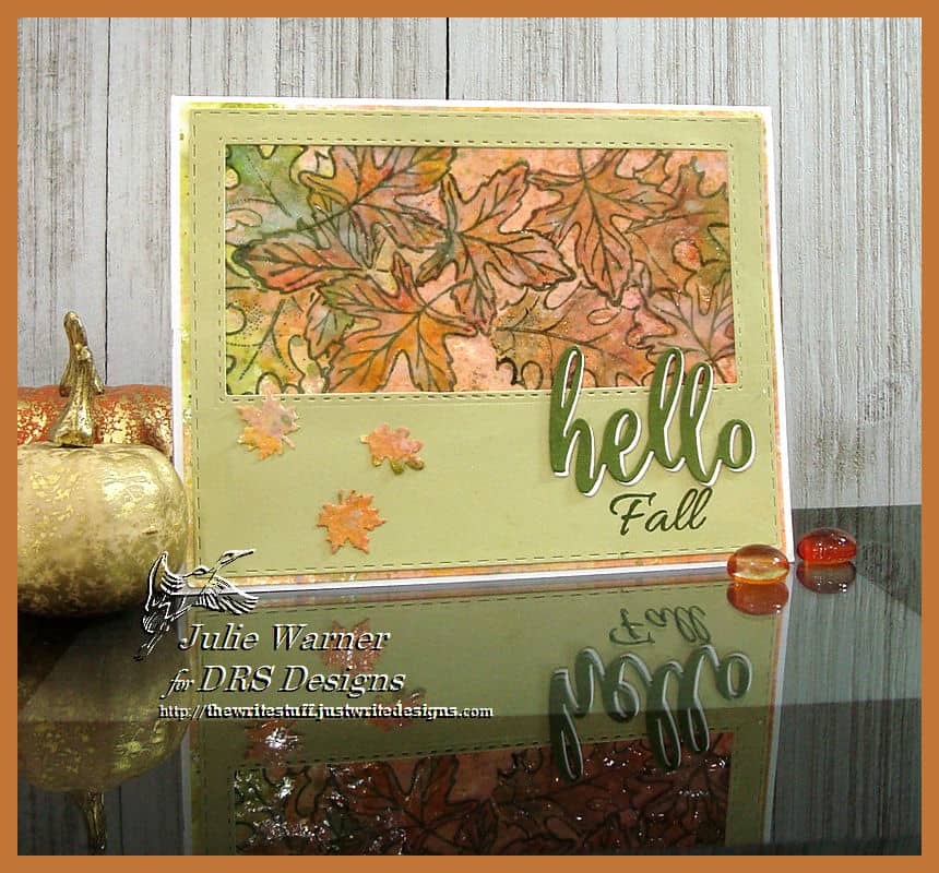
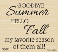
For my card, I first inked a craft sheet w/ distress oxide inks, misted then pressed my paper to it. After I dried it, the leaves were stamped, masking as I went. I pressed some mini Distress inks to a solid version of the leaf, spritzed it then stamped it inside the outline leaves. It still didn’t look right, so I used a paintbrush & some embossing ink & painted inside the leaves & clear embossed them to make them stand out a bit more. The green pear top layer was die cut & the window was cut using my resizing technique to make it longer than a std rect. The 3 little leaves are from a couple of small punches. The fall part of the greeting was stamped & the hello is a double stacked die cut.
Thanks so much for stopping by!
Supplies:
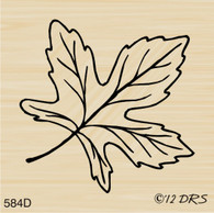
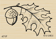
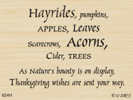
| Stamps: DRS Designs – Open Leaf, Fall Leaf w Acorn, Med. Silhouette Leaf, Goodbye Summer (inside: Hayrides Harvest ) |
| Paper: Staples 110# white, green pear |
| Ink: Versaclair shady lane, Distress inks dried marigold, tattered rose, worn lipstick, Distress oxide inks in peeled paint, dried marigold, tattered rose, worn lipstick |
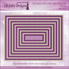
| oAccessories: Rubbernecker Rectangle Stitch dies, double stitch rectangle dies, MFT Hello & Thanks dies, Spellbinders A2 Matting Basics A , clear embossing powder, embossing ink, craft sheet, sm. leaf punches |
