Welcome to the September Blog Hop for Serendipity Stamps! If you arrived here from Mary’s Blog, you are in the right place..if not, you may want to head over there first.
The Prize – One $20 gift code will go to one random commenter from the blogs. So be sure to visit all the blogs because you don’t know which one the winner will be drawn from. You have through Sunday September 25 to leave comments on the blogs for a chance to win. Mary will announce a winner on September 26. The sale this time is buy 3 get a 4th item free! No coupon required…the lowest item will be free & if you order 8, you get 2 free, etc. Good thru 9/25/16. Each month a different image is 50% off. This month- it’s the Postoid Set! On the third Wednesday of every month., we’ll be celebrating with a Blog Hop! For another chance to win, be sure to play along with our monthly challenge. You can get all the details on the challenge HERE.

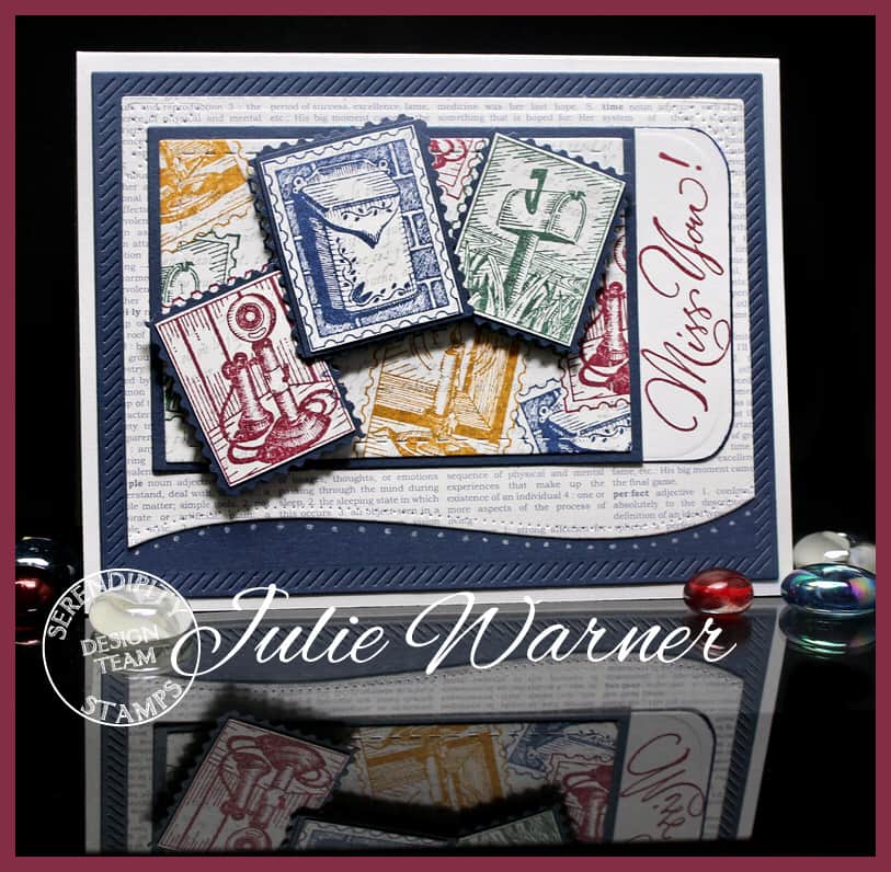
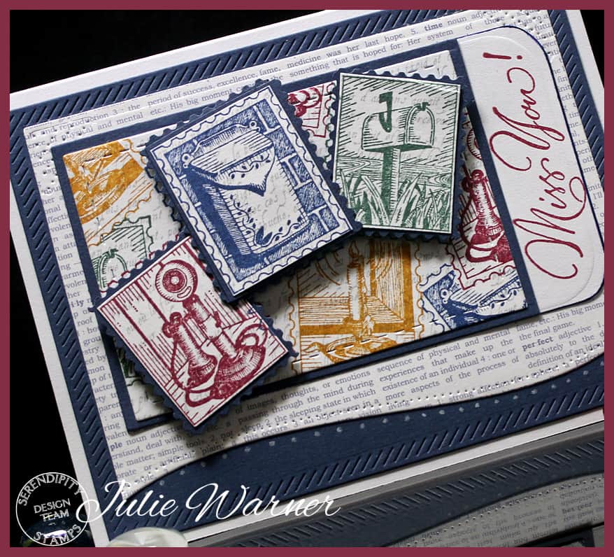
Since the challenge for this month is “no coloring” & I really love color, I thought a good way to add color would be by using different ink colors. I started by die cutting the stitched rectangle out of one of the faint printed pieces of the designer paper then stamping the 4 different stamp images w/ four different ink colors. I did have to do a little masking. Three extra stamp images were also stamped & the red & green ones were fussy cut inside the post edge, the navy one was trimmed outside the postage edge. These were all attached to larger navy layers that I used the postage edge scissors to trim (remember all those scissors we all bought way back when?)
The greeting was stamped on a white piece the same width as the postoid panel & I used a lg. corner rounder to trim the ends. The text print paper was die cut w/ a rectangle then I used a dotted edge curved die to cut away the bottom & add the faint white dots w/ a white Prismacolor pencil.
Please be sure to comment on all the DT blogs. It will be much appreciated & will also increase your chances of winning! Now I’ll send you on to Karen’s Blog. Here’s the order in case you get lost.
Julie Warner (you are here!)
Thanks so much for stopping by!

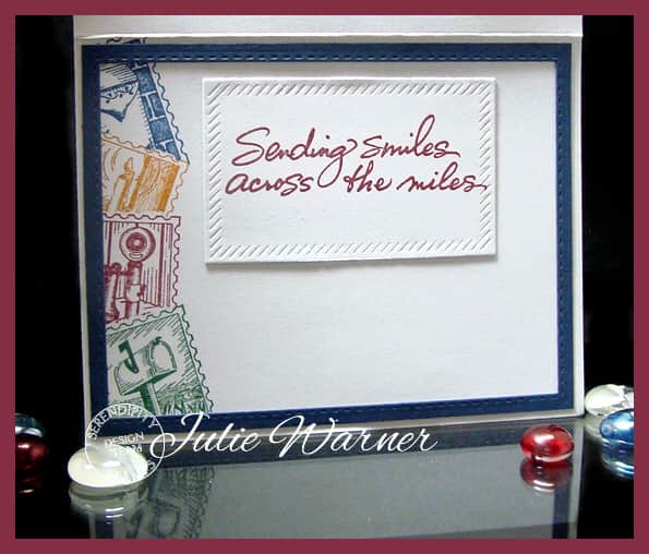
| Stamps: Serendipity Stamps – Postoid Set, Miss You, (inside- Sending Smiles) |
| Paper: Staples #110 white, navy, dp (Teresa Collins- Everyday Moments) |
| Ink: Adirondack denim, butterscotch, cranberry, Archival library green, |
| Accessories: Spellbinders A2 matting basics A dies, Fiskars postage edge scissors, MFT Diagonal Stitched Rectangles dies, AE Dotted Borders dies, white Prismacolor pencil. Lg. corner rounder, Lil’ Inker stitched rectangle dies |






The different colors with the newsprint looks vintage and modern at the same time. Nice job!
A beautiful arrangement of these pretty, detailed stamps; someone will definitely feel ‘cheered up’ when this card arrives in their mailbox.
~carol
Love the way you used different color inks to add you color!
Great card. Love your use of the stamps inside.
Super cute card; love all the details. Thanks for sharing
This is such a great card! I love the idea of using different ink pads to stamp your images : )
Patti
Love the color combo and how you layered the images. Fabulous card. TFS
I like the vintage images and the different ink colors you used.
I simply love this! No coloring in but so much color! Even the inside is gorgeous! Don’t you love this stamp set !
Love your card Julie! Love that you used the postage stamp scissors – that was one of my first purchases when I started stamping! Great colors – Hudson Bay Blanket colors! You always have wonderful little touches like the softly curved die cut border along the bottom and the tabbed Miss You!
Love this stamp set and what you did with it! Vintage colors adds an “authentic” touch. Very nice!!
Julie, what a wonderfully creative way of not adding colour. Love the different coloured postoids ( especially the blue one) and great masked background. I’ve been trying to find nice postal edge scissors or a punch!
Your cards are always so beautiful and this one is no exception. Love the layout.
So cool. Love those little postage images. Hugz
Such beautiful cards!
I love how you used the colored inks on each different stamp. Back to basics but put together so well!
Great card.
The colored inking
is fabulous on your
card! Wonderful design.
Carla from Utah
The stamps are a fun idea.
The cutting around them is so
authentique – really makes
them look real.
thanks for sharing.
and the inside is just as pretty as the outside!
I love these amazing vintage ink colors! This really gives it an old-fashioned postcard look! Gorgeous!
Take care!
Michele
I love your pretty little postcard images as the central feature on this card Julie, and the script on the dark blue in the background complements it beautifully. The inside is just as gorgeous as the outside too. x
Julie, your card is incredibly beautiful in every way! The smiles in it will absolutely explode when the envelope is opened!
Love the postage set and how you created such a wonderful card.
Love the vintage look to this pretty card!