Welcome to the North Coast Creations June Release! You’re going to love these 2 new Floral sets! And the greetings have such beautiful fonts!
Prize Information:
Just for commenting on the Design Team Blog Posts, you have a chance to win a $10 NCC Gift Certificate, good towards the purchase of NCC Stamps. You have until June 24, 2015 at 10:00 PM EDT to leave a comments on the participating designers blogs for a chance to win! Two random winners will be selected from the comments left on the designers blogs, the winners will be announced on the NCC Blog on June 25, 2015, be sure to check back there to see if you have won!
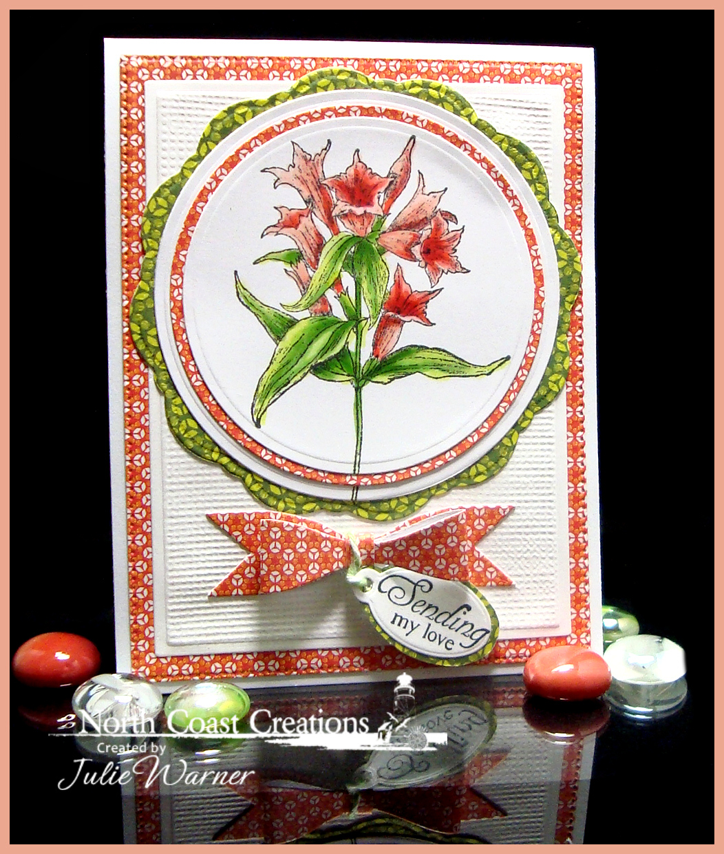
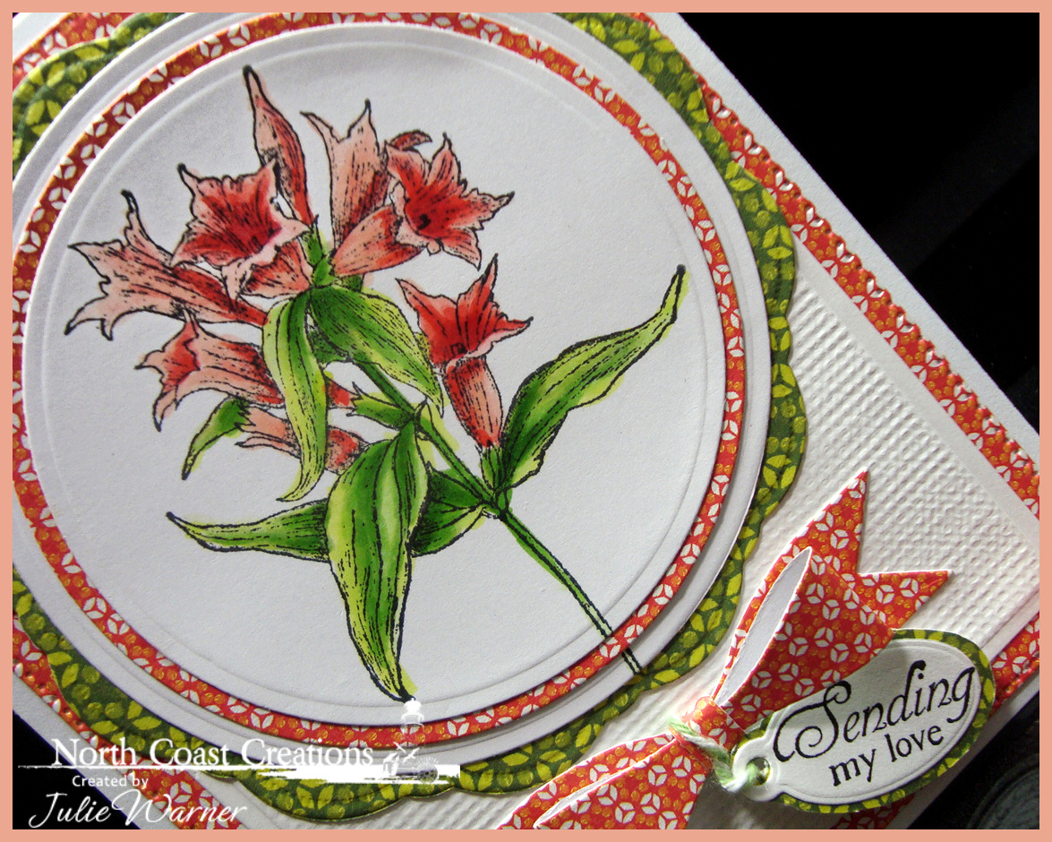
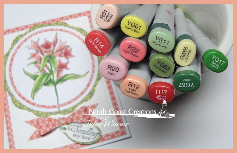
For my first card, I’m using the beautiful Floral Sentiments 8 set. After coloring it with Copics, I die cut it with a large circle & the reddish print circle with the Matting Circles dies. The largest green print was die cut using the outer die of the Doily die set. The large reddish layer was die cut w/ the Flourished Star Pattern die. The white layer was die cut & to add a little texture, I left it in the die, spritzed it w/ water then laid a piece of cross stitch canvas on top and used it as an embossing plate. For the cute little bow, here’s a link to make one using an envelope punch board..it’s just pictures BOW.These are the Copics I used.
Supplies:
| Stamps: North Coast Creations – Floral Sentiments 8 |
| Paper: X-Press It white, Neenah white, dp (SEI -Sunny Day) |
| Ink: Memento tuxedo black |
| Accessories: ODBD Flourished Star Pattern, Matting Circles, Doily, Mini Tags dies, Spellbinders A2 matting basics A & circle dies, Copic markers, twine, Envelope punch board, cross stitch canvas mesh |
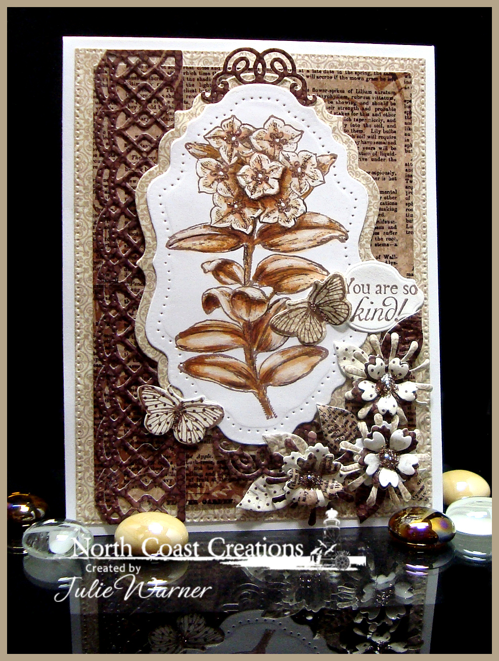
My next card uses the lovely Floral Sentiments 7. Instead of bright colors, I decided to keep this one neutral to go with the lovely Vintage Ephemera paper collection. This wasn’t easy for me, lol. I love vibrant colors!
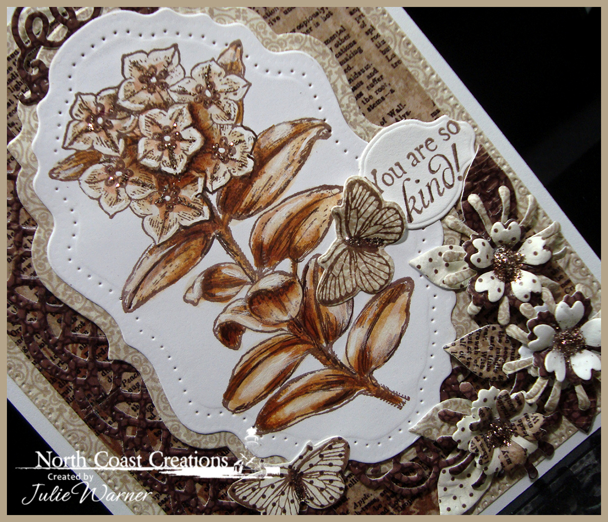
I went a little over the top with the die cuts and flowers, but when using this many neutral colors, more texture gives it more interest. The layers, border, top scrolls, butterflies & flowers were all die cut out of different pieces of the same paper collection. To add a little sparkle, I put some stickles in the center of the die cut flowers and also on the flowers of the image.
Here’s a look at the inside using some leftover flowers & paper.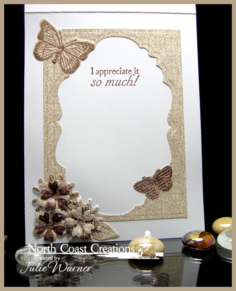
These are the Copics I used for the image.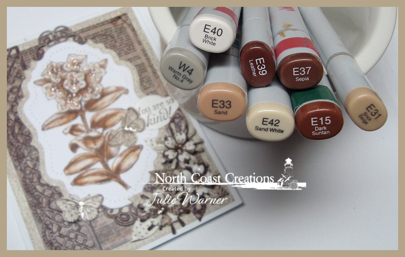
Supplies:
| Stamps: North Coast Creations – Floral Sentiments 7, ODBD – Butterflies & Bugs |
| Paper: X-Press It white, dp (ODBD Vintage Ephemera paper collection) |
| Ink: Memento rich cocoa |
| Accessories: ODBD Flourished Star Pattern, Vintage Labels, Vintage Flourish Pattern, Mini Tags, Asters, Butterflies & Bugs, Birds & Nest, Beautiful Border dies, Spellbinders A2 matting basics A dies, stickles (Mercury glass color) |
Please be sure to visit all of the DT for more inspiration and to improve your chances of winning!
Thanks so much for stopping by!


Stunning coloring. The colors of your first card are quite pretty and the neutrals of the second card are striking!
Your cards are adorable Julie love all the color combinations!!!
so cute and detailed…
Julie I love both cards as I always do!!! Looks like we had the same idea to do sepia!
Hey Miss Julie, I always enjoy looking at your creations! You always have so many nice little details to look at and these are no exception! The color combos are lovely on both. The pop of colors and details like stamping the large circle underneath are so interesting!! The sepia tones of the second are so relaxing with a nod to a bygone era are perfect for the stamp!!! Two real beauties!!!
I am finally realizing what I love about your cards…I mean beside the fact that they are always clean and sharp, designed perfectly and etc, etc. It’s that you always use color combos, like opposites, that are always so appealing to the eye!
On your sepia card, your extras are just perfect! Love them both!
Wow, Julie! These cards are absolutely stunning!
These are just Beautiful, lovely coloring on both but I will have to say the second card to me is Absolutely stunning, both on the outside and inside!
Just Loved both these cards. The Red one is my favorite. The colors just sing to me of Summer. The Brown version using the Bee dies and stamps is wonderful too.
Thank you so much for sharing your creativity.
Liz
Both your cards are so beautiful. Not sure if I like the pretty colors or the sepia toned card better. Both are so awesome.
Stunning cards, Julie! Love the added pops of color to the top card, the Sepia tones in the bottom card a just beautiful! Fabulous designs!
Beautiful samples, Julie! I love the layers and colors on the first and brown design…. fabulous!