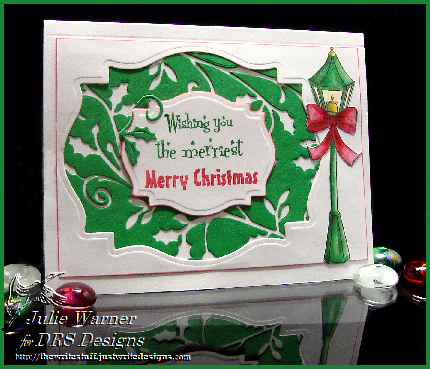
For the Color Challenge (CC403) on Splitcoast, we are to use green, red & gray. My CAS card is a lot of white, green, a little red and a tiny bit of gray. Actually, I only used the gray to shade the lamp post.
The images are all new from DRS Designs. For the rest of my card, I die cut a couple of flourished holly out of the green then used the negative, or leftover part for my background. The large white frame was also a leftover from cutting a larger label shape out for another card. I used markers to color the rubber of the sentiment in two colors, and the rest of the sentiment says “and the happiest Happy New Year” so I put that part on the inside since I could only fit this much on my little die cut label. The lamp post was colored w/ copics and cut out. I just love the traditional Christmas colors and festive look of the sentiment and lamp post.
| Stamps: DRS Designs |
| Paper: Neenah white, green |
| Ink: Memento tuxedo black |
| Accessories: Copic markers, Holly Flourish die (Cheery Lynn), Spellbinders labels 18 dies, Tombow markers (to stamp the sentiment) |


This is stunning. Love all the detail – and that negative background – who would have thought? Great idea!
Julie, this is truly a lovely card. From the wonderful coloring on the lamppost to your ingenious negative background, it’s gorgeous!