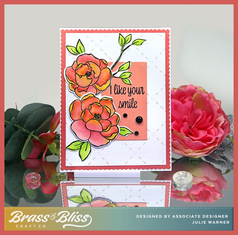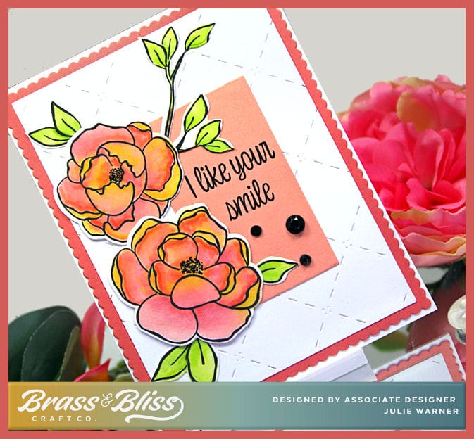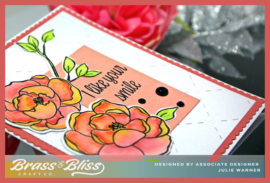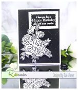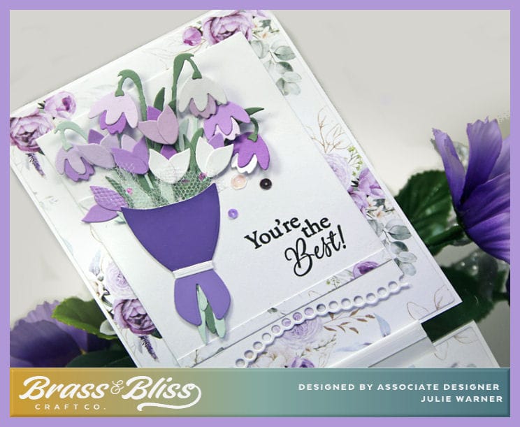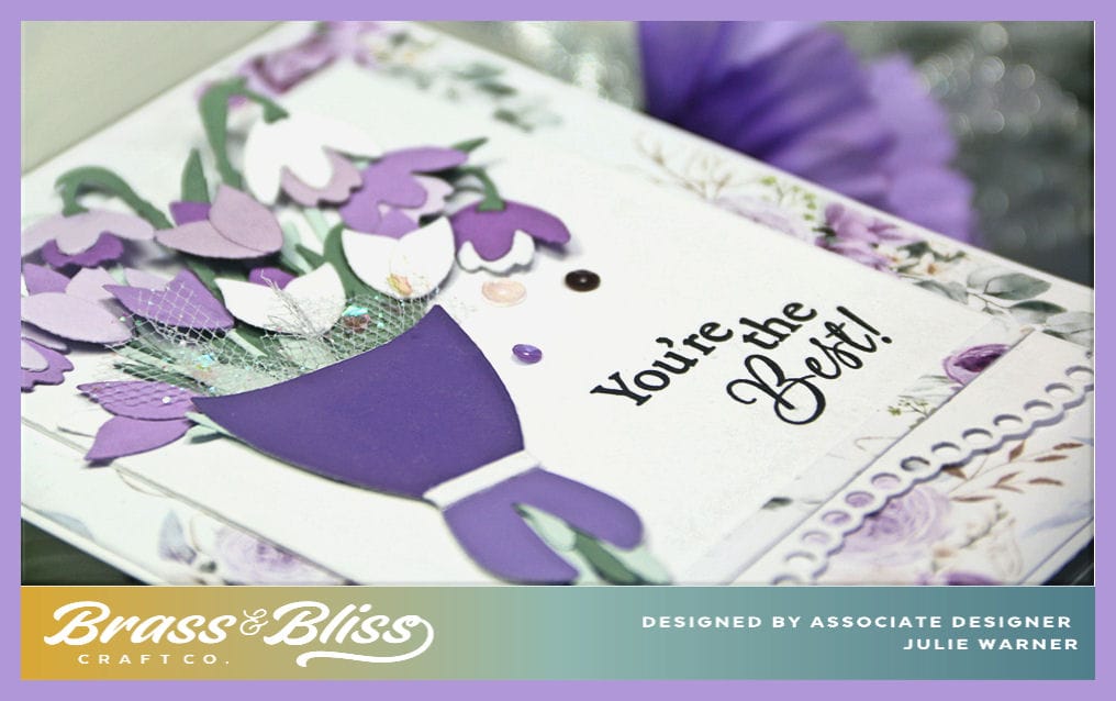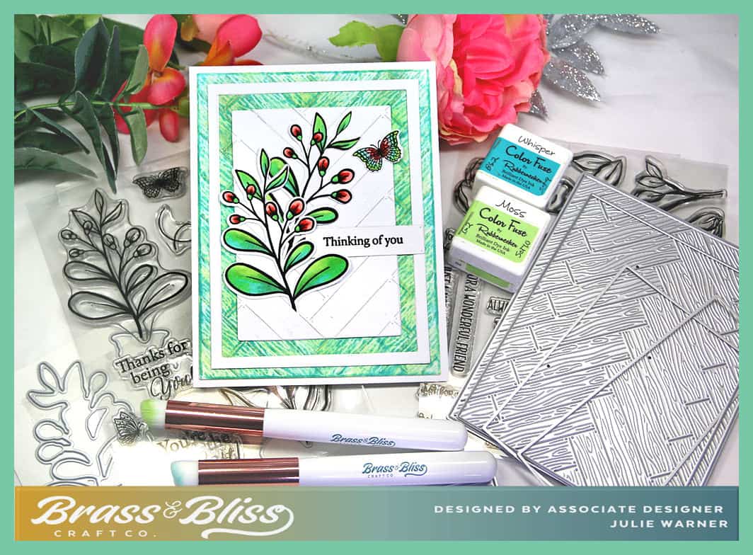
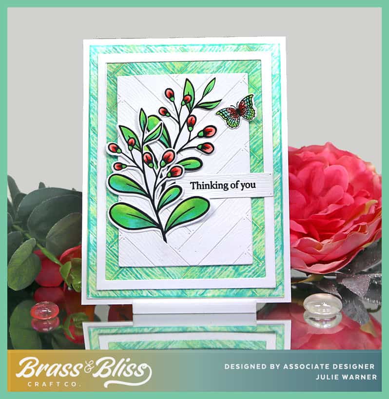
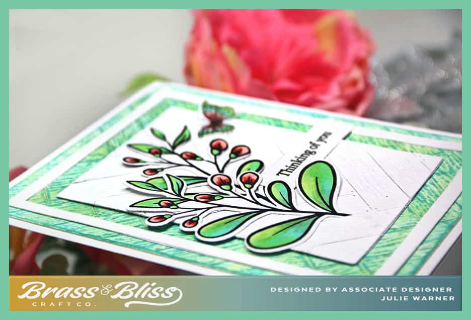
An clean, colorful, easy to make card for any number of occasions. The stamps have matching dies & I’m really loving this woodplank cover die. Use it plain white or inked for totally different look.
For the Inspiration Challenge (IC960), we are visiting Daily Paintworks & their Pinterest Boards where I found THIS picture to inspire me.
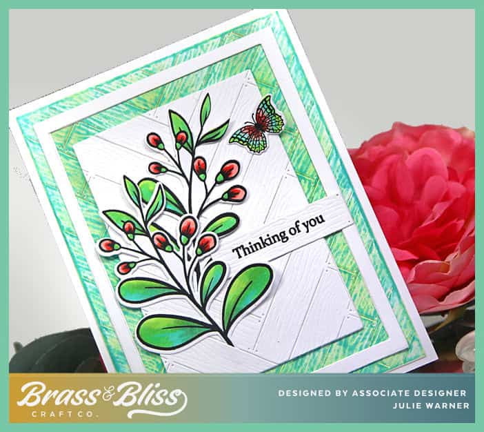
My card is pretty simple. I die cut the large wood plank panel then used brushes to add the green ink & a little of the blue-green, then used the blue green to rub directly over the top to darken all the raised areas. A smaller white panel was die cut a few times. First w/ the larger die, then a smaller one (to create the white frame) and finally an even smaller die to create the rectangle inset. I placed this in the center of the wood plank die & ran it thru the die cut machine. The branches were all colored & die cut & I used the individual wood plank set to cut the piece for the greeting before stamping on it.
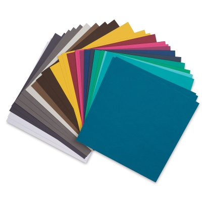
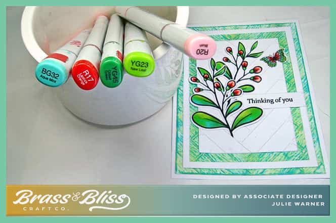
Here are the Copics I used:
Thanks so much for stopping by!

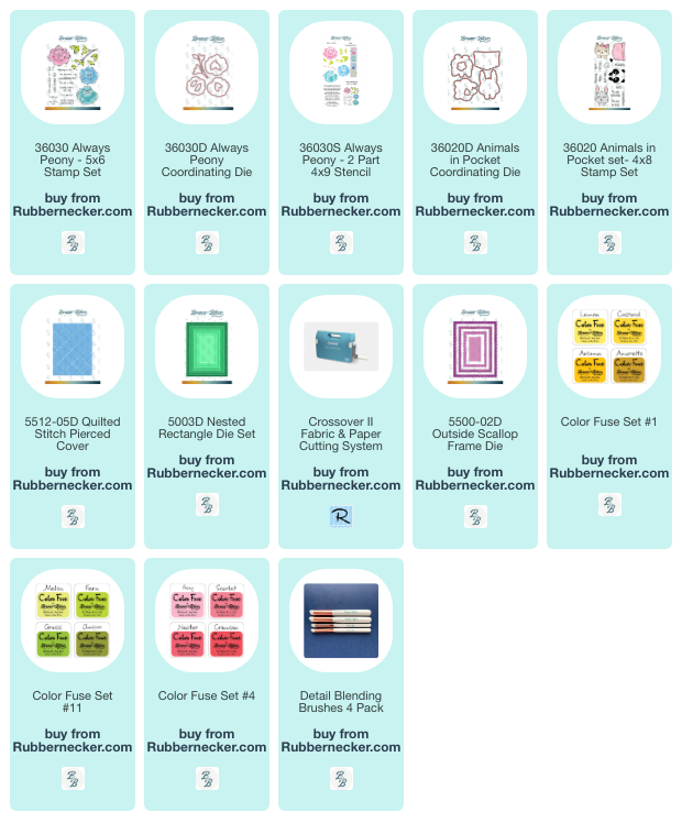
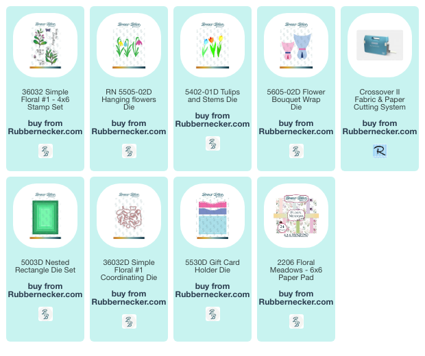
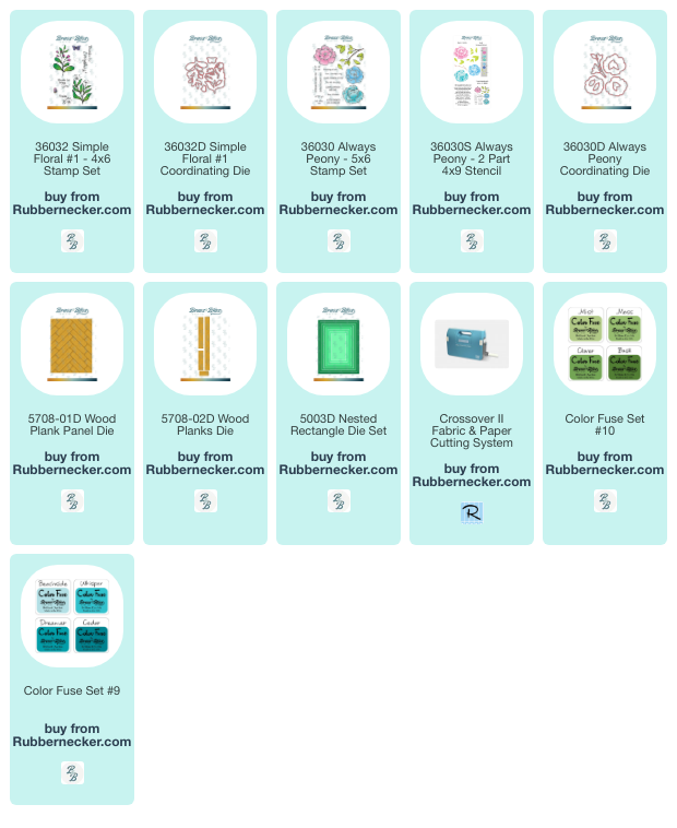
Supplies:
| Stamps: Brass & Bliss: Simple Floral #1, Always Peony set (greeting) |
| Paper: Staples 110# white |
| Ink: VersaClair nocturne, Brass & Bliss/Rubbernecker Stamps: Color Fuse ink set #9, set #10 |
| Accessories: Brass & Bliss/Rubbernecker Stamps: Rectangles, Wood Plank Panel, Wood Planks, Simple Floral #1 dies, Detail Blending Brushes, , MISTI, Copic Markers |
|

|
|

|

|

|
You might also like: